5 UX Tools I Use Every Day
Behind every great user experience is a powerful toolkit. Discover five essential UX tools that transform collaboration, testing, and design impact.

As a UX designer working across complex systems from enterprise software to data-heavy platforms my toolkit has evolved into a precise ecosystem. Each tool serves a specific role: one helps me think, another helps me test, another keeps me organized.
In this article, I’ll walk you through the five UX tools I use every single day, how I use them, and why they’ve become integral to my workflow. These aren’t just popular names they’re tools that consistently enable clarity, speed, and collaboration in environments where design is both strategic and operational.
Miro - Turning Complexity into Clarity
Before pixels, there’s thinking. And Miro is where that thinking takes shape.
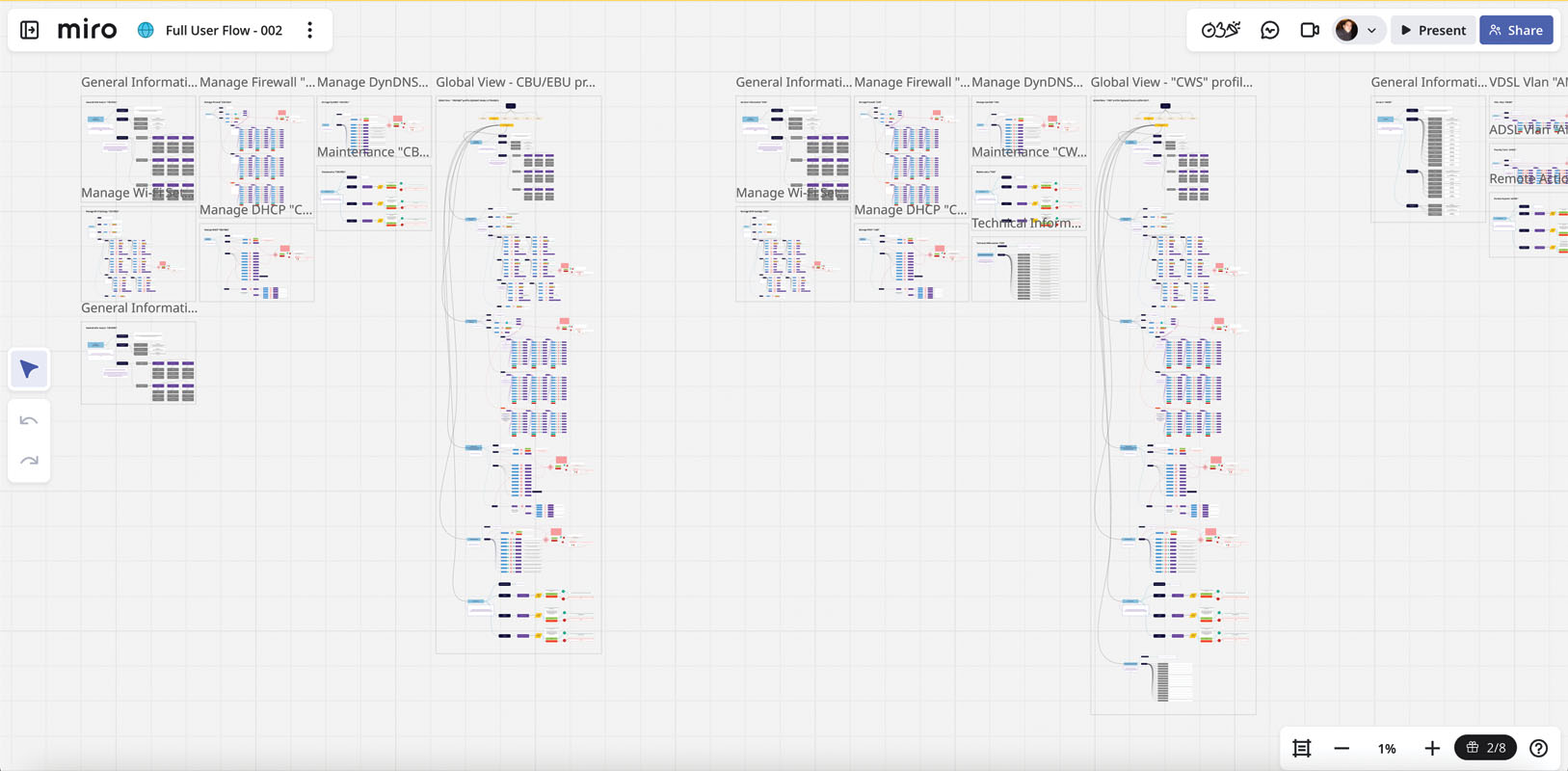
Miro functions as a digital whiteboard but for UX professionals, it’s so much more. It’s a visual reasoning tool, helping teams make sense of ambiguity, organize insights, and design solutions collaboratively.
How I Use It
I use Miro during the discovery and research phases, where clarity is scarce and structure is still forming. From user journey maps to affinity diagrams, service blueprints, and design workshops, Miro is where strategy and creativity meet.
During user research synthesis, I cluster pain points and observations into themes using sticky notes. During ideation, I run collaborative sessions with cross-functional teams to co-create solutions.
Why It Matters
UX is rarely about designing interfaces it’s about designing understanding. Miro helps make invisible processes visible, allowing everyone to see how research translates into design.
The real advantage is alignment. When designers, developers, and business stakeholders see the entire system laid out visually, discussions become more objective and solution-oriented.
Real-World Example
In a redesign of an enterprise CRM tool, our team mapped every customer touchpoint in Miro. The visual flow exposed redundant support loops and internal inefficiencies that were previously invisible in documentation. That exercise alone redefined the project scope before a single interface was drawn.
Miro is where complexity becomes clarity, and that’s priceless for UX work.
Link: Miro Official Website
Figma - The Collaborative Heart of Modern UX
If I could keep only one tool, it would be Figma.
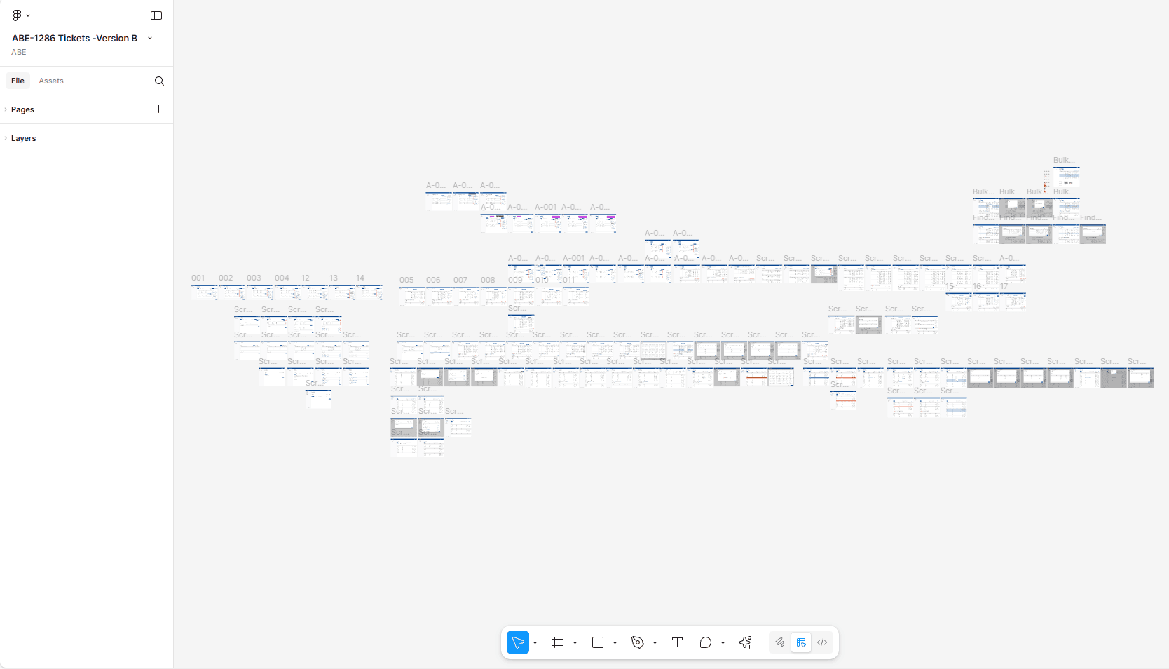
Figma isn’t just a design tool it’s a collaboration platform disguised as a canvas. It redefined how teams build products by turning static design files into living, shared workspaces.
How I Use It
Every stage of my design workflow lives in Figma from early wireframes to high-fidelity prototypes. I rely on its component libraries, variables, and auto layout features to maintain consistency across products and brands.
For larger organizations, where multiple teams contribute to a shared ecosystem, Figma’s design tokens and shared libraries allow for system-level scalability something that older tools struggled with.
Real-time collaboration is the secret ingredient. Product managers, developers, and stakeholders can jump into the same file, leave comments, or even suggest changes. This transforms design from a handoff process into a conversation.
Why It Matters
Figma’s strength lies in democratizing design visibility. It eliminates silos by giving everyone a view into the design process. This transparency accelerates decisions and ensures alignment especially when working across distributed teams.
In complex environments like enterprise UX, where design must coordinate with legal, compliance, and development simultaneously, that kind of collaboration isn’t optional it’s critical.
Real-World Example
When designing a new financial dashboard for a B2B platform, I used Figma to host live review sessions. Data analysts commented directly on the chart visualizations, developers inspected components for implementation, and stakeholders previewed prototypes without exports or presentations.
The result? We saved two weeks of iteration time simply by letting everyone work together, in one place.
Link: Figma Official Website
Maze - Continuous Testing at the Speed of Design
Great design isn’t defined by how beautiful an interface looks, but by how well it performs. And that means testing early and often.
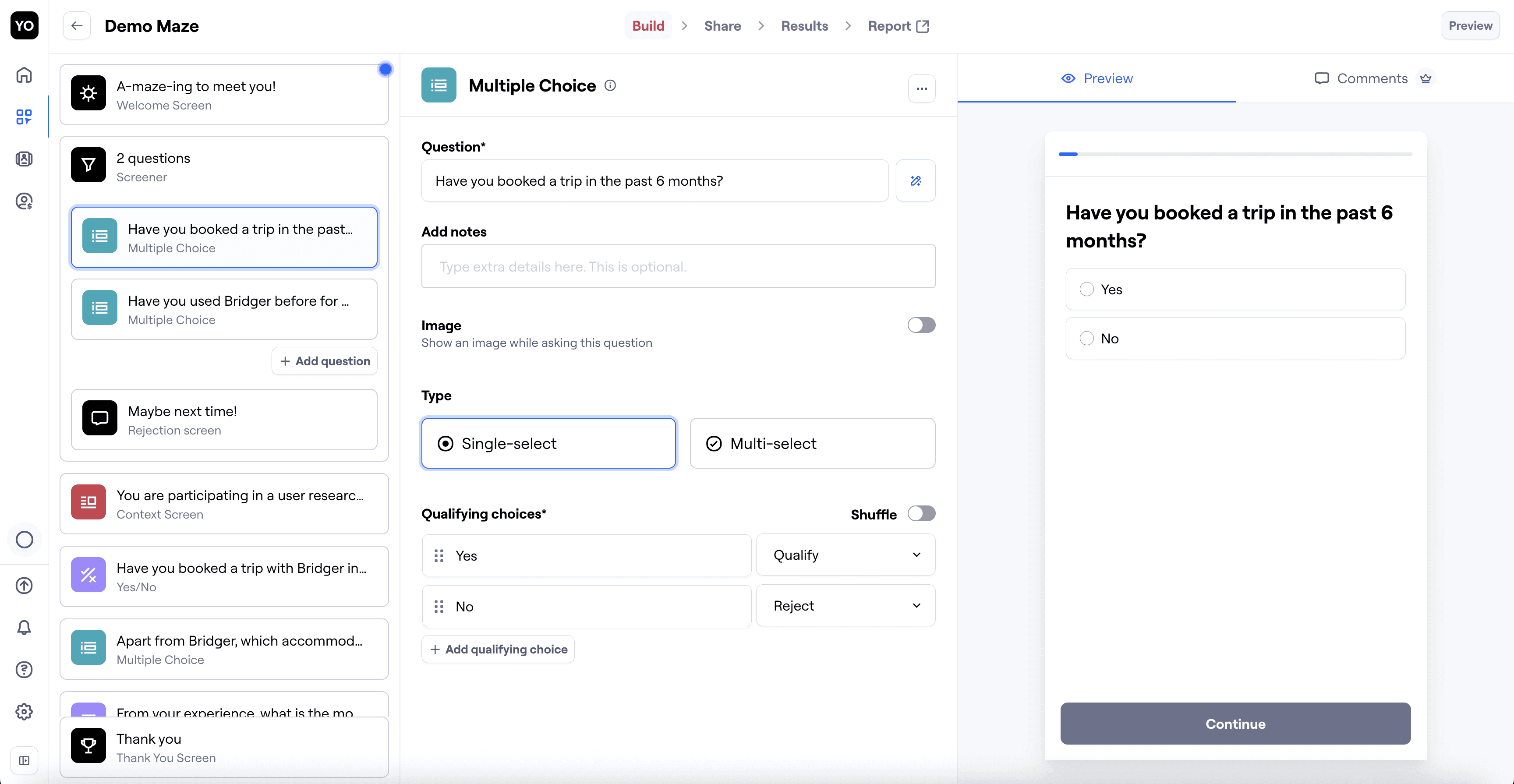
For that, my go-to is Maze a usability testing tool that connects directly to Figma prototypes.
How I Use It
After completing an early interactive prototype in Figma, I import it into Maze to run remote usability tests. Maze provides quantitative insights (like completion rates and task success) and qualitative feedback through comments and open-ended questions.
This workflow allows me to validate concepts without waiting for development. Within 24 hours, I can test with 20–30 users and adjust designs before they ever reach code.
Why It Matters
Traditional usability testing often requires scheduling, lab setups, and weeks of coordination. Maze breaks that bottleneck. It integrates testing into the sprint cycle, making validation an everyday part of design rather than an afterthought.
This is especially vital in agile or enterprise settings, where rapid decision-making is key. Continuous testing ensures design is guided by evidence, not opinion.
Real-World Example
During a checkout flow redesign, Maze revealed a 28% drop-off on a page where users misunderstood the “Apply” button. The insight came overnight leading to a quick fix that improved conversion by 17%.
Without Maze, that confusion might have only surfaced post-launch, buried in analytics.
Maze keeps my design process honest, fast, and user-centered.
Link: Maze Official Website
Notion - The Brain of My Design Practice
Design is more than visuals it’s also documentation, communication, and reflection. That’s why Notion has become my design brain.
While Figma holds designs and Miro holds ideas, Notion holds knowledge.
How I Use It
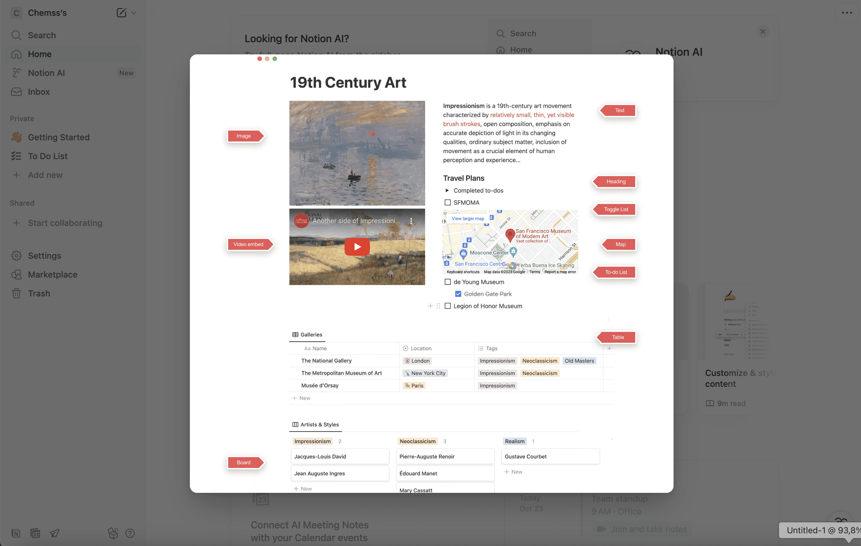
I use Notion to organize design documentation, maintain UX research repositories, and record decision logs. Each project gets its own page with sections for:
Design briefs
Research insights
Design decisions and rationale
Testing outcomes
Next steps and learnings
This transforms Notion into a UX knowledge base something every mature design team needs.
Why It Matters
In fast-moving organizations, design context is often lost. People join, projects pivot, and decisions get buried in emails. Having a centralized documentation hub ensures continuity of reasoning new designers can understand why something was designed the way it was, not just how.
It also supports accountability and transparency, two core principles of mature UX practice.
Real-World Example
During a global platform redesign, our UX team used Notion to track every decision against a supporting insight or test. When stakeholders questioned why we simplified certain features, we could instantly show the research and test data behind it.
The effect was powerful: design debates turned into data-informed discussions.
Notion, in essence, makes design reasoning visible and that visibility builds trust.
Link: Notion Official Website
Hotjar - Watching Real Behavior, Not Just Numbers
Even the most well-researched design hypotheses can fall short once users interact with the live product. That’s where Hotjar closes the loop.
Hotjar provides session recordings, heatmaps, and feedback widgets, allowing me to observe real user behavior in production.
How I Use It
After a product or feature goes live, I monitor Hotjar to identify friction points and unexpected interactions. Heatmaps show where users click, scroll, and hesitate, while session replays reveal subtle usability issues that analytics alone can’t capture.
I also use its on-site surveys to gather contextual feedback directly from users in the moment of interaction often uncovering insights that formal interviews miss.
Why It Matters
Analytics tell you what users do. Hotjar shows you why they do it. Watching a real person struggle to complete a task is one of the fastest ways to build empathy and prioritize improvements.
Hotjar turns data into narrative evidence bridging the gap between empathy and metrics.
Real-World Example
In a B2B onboarding process, Hotjar session replays revealed users hovering repeatedly over a “Save” button that didn’t actually autosave progress. That observation led to a simple UX fix that reduced support tickets by nearly 40%.
Hotjar makes the invisible visible. It transforms analytics into actionable empathy a rare and powerful combination.
Link: Hotjar Official Website
Tools Are Reflections of Process
Tools don’t make a designer but they shape the rhythm of design.
Each of these five tools, Miro, Figma, Maze, Notion, and Hotjar serves a specific function in a holistic UX process:
Miro transforms chaos into structure.
Figma turns collaboration into co-creation.
Maze validates design decisions with real users.
Notion preserves collective design intelligence.
Hotjar closes the feedback loop post-launch.
What unites them isn’t their popularity but their complementary roles. Together, they create a continuous cycle of ideation, validation, documentation, and iteration the hallmarks of effective, scalable UX practice.
As UX continues to mature as a discipline, the designers who thrive will be those who don’t just know how to use tools but understand how those tools fit into a system of thinking.
At the end of the day, tools are only as powerful as the questions you ask with them.
The goal isn’t to design faster it’s to design smarter.
Author by Chemss Salem
CopyRight by Chemss Salem