Pretty Doesn’t Mean Ready: How Misusing Wireframes Breaks UX Strategy
In enterprise environments banking, energy, telecom, education, and government the pressure to deliver quickly often creates a dangerous misconception.

In enterprise environments banking, energy, telecom, education, and government the pressure to deliver quickly often creates a dangerous misconception: that a polished-looking wireframe equals a solid user experience. It’s a belief that can derail entire programs.
After two decades working across heavily regulated industries and large-scale SaaS platforms, I’ve seen this pattern repeat itself: wireframes that “look finished” but aren’t aligned, validated, or strategically grounded. The product appears to have momentum, but underneath, the foundation is fragile.
The truth is simple: pretty doesn’t mean ready.
Wireframes are not about visual appeal they’re about decision-making, logic, and understanding. When teams misuse them, UX strategy breaks, communication collapses, and the organization pays the price.
Wireframes Are Thinking Tools, Not Marketing Assets
Wireframes were never meant to be attractive. Their real purpose is to:
define structure
map logic
align cross-functional teams
identify risks early
explore multiple directions quickly
validate user needs before visual influence creeps in
But in many enterprise environments, wireframes get unintentionally promoted into pseudo-designs. Teams treat them as near-final UI the moment they look clean, aligned, or branded. And once that happens, stakeholders stop discussing meaning and start discussing aesthetics.
When that shift occurs too early, the design process collapses into decoration, not strategy.
How Over-Designed Wireframes Create Strategic Damage
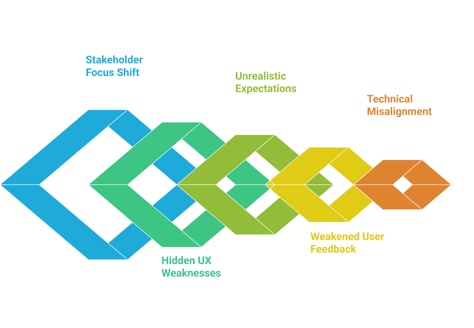
1. They Fast-Forward Stakeholders Into “Solution Mode”
When wires look too high fidelity, conversations drift away from business logic and toward visual details.
Instead of asking:
“Does this workflow support our regulatory requirements?”
Stakeholders ask:
“Can we use our new icon set here?”
“Why isn’t this screen responsive yet?”
This prematurely narrows the design space and limits exploration before the problem is fully understood.
2. They Hide Deep UX Weaknesses
A polished wireframe can unintentionally camouflage unclear flows, missing states, or flawed logic. Teams may assume the thinking is complete because it looks complete.
But I’ve seen “beautiful” wires that:
lacked error handling
missed edge cases
ignored system constraints
assumed impossible technical integrations
skipped critical accessibility considerations
Aesthetic polish can mask structural debt debt the development team pays for later.
3. They Create Unrealistic Expectations in Regulated Industries
Government, banking, energy, and telecom programs rely heavily on predictability and compliance. Presenting wireframes that look final even unintentionally causes stakeholders to believe development is close behind.
When they eventually learn those wires were conceptual, trust erodes. And trust is the most valuable currency UX has in enterprise transformation efforts.
4. They Weaken User Research Results
Users tend to be polite. When they are shown something visually polished, they hesitate to critique it even when it doesn’t actually solve their problem.
They say:
“It seems fine.”
But “fine” is not validation.
Pretty wireframes suppress real feedback and distort test outcomes.
5. They Cause Technical Misalignment
Development teams may interpret polished wireframes as “approved requirements.” This locks teams into premature decisions and triggers unnecessary rework when the actual logic differs from what the visuals suggested.
In enterprise platforms, this can translate into months of wasted effort.
What Wireframes Should Be at Each Stage
Wireframe fidelity should always match the stage of understanding not the desire to impress.
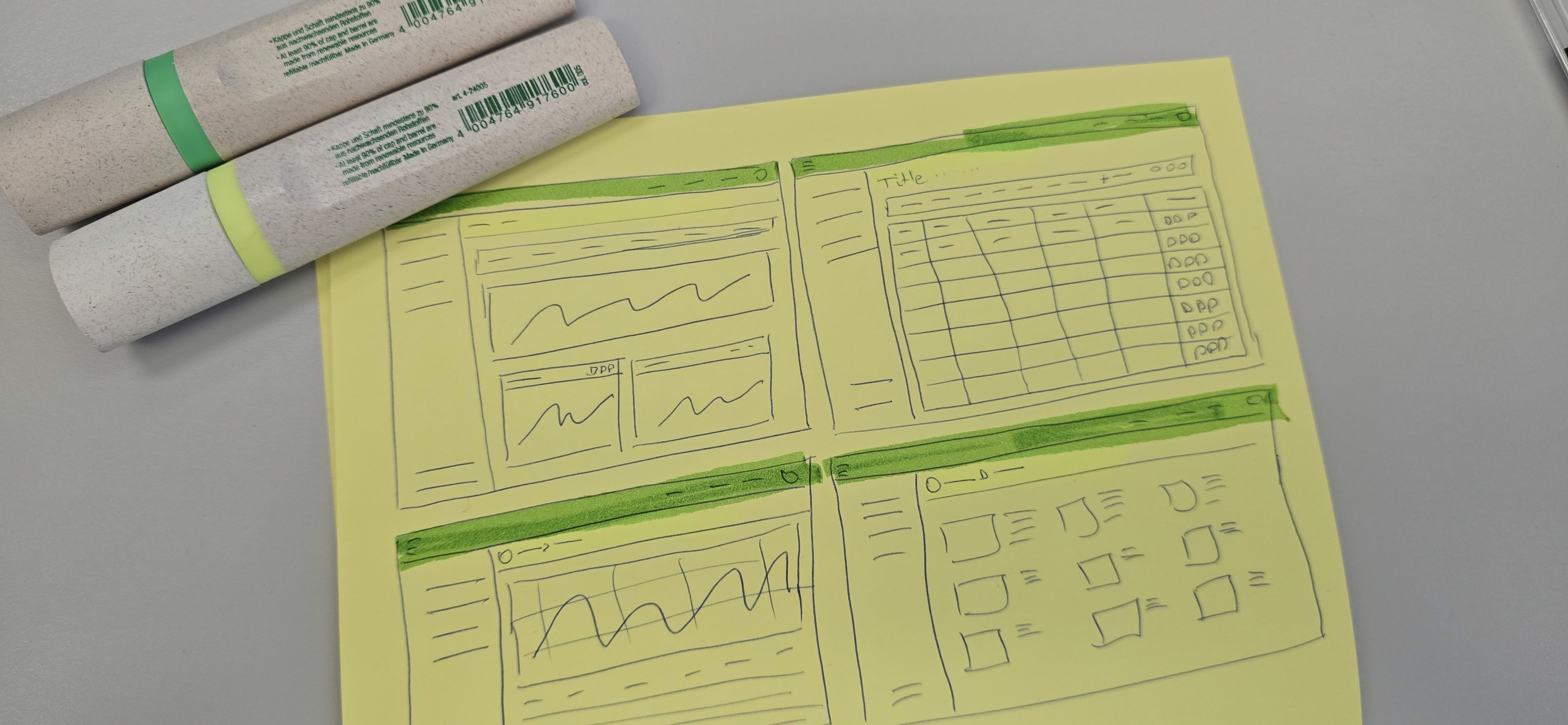
Low Fidelity – Strategy Phase
Purpose: explore and eliminate assumptions.
Appearance: boxes, arrows, placeholders, hand-drawn feel.
Focus: logic, tasks, relationships.
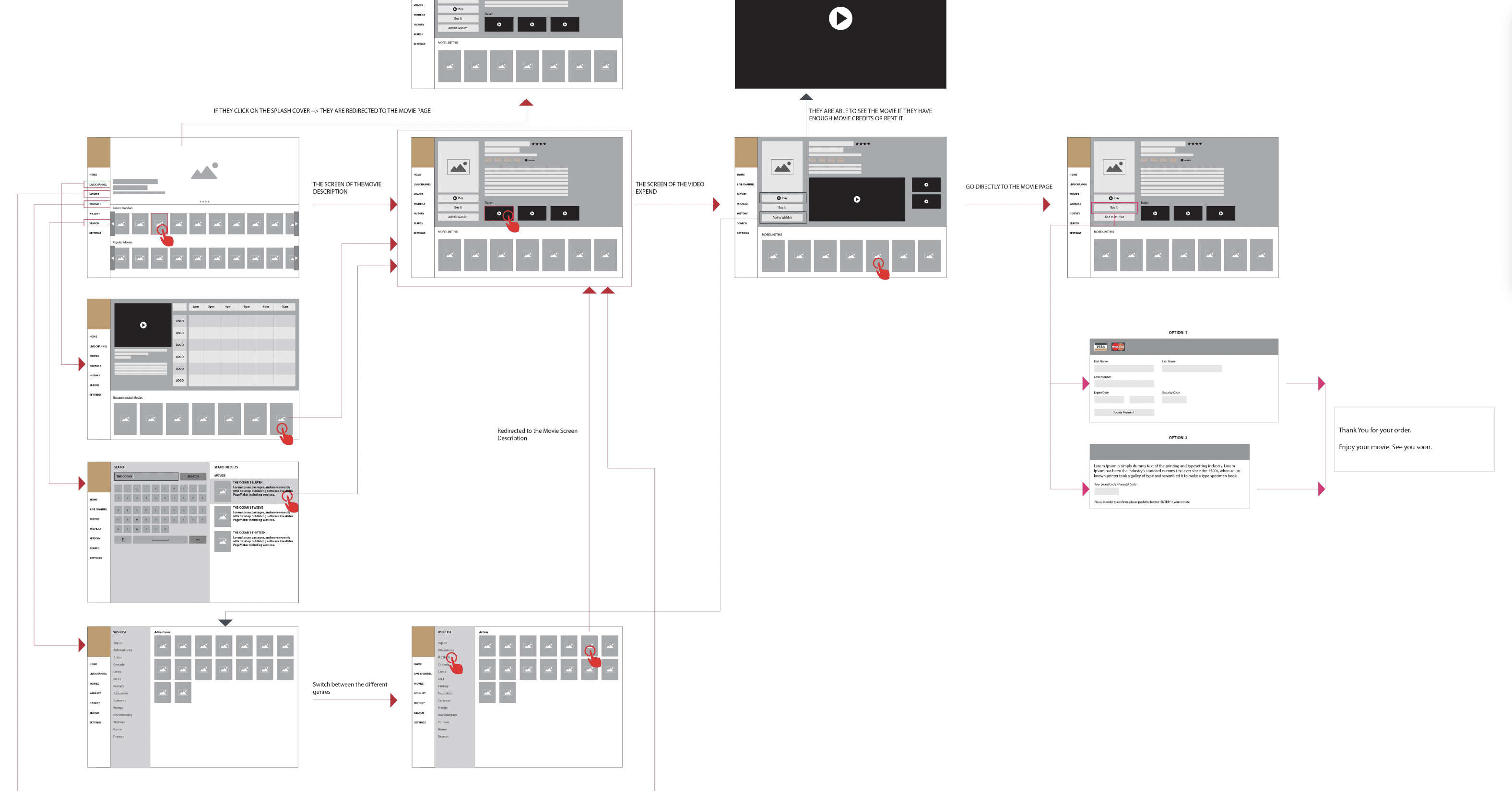
Mid Fidelity – Definition Phase
Purpose: align with engineering and business owners.
Appearance: structured layouts, clear hierarchy, grayscale.
Focus: flows, rules, states, dependencies.
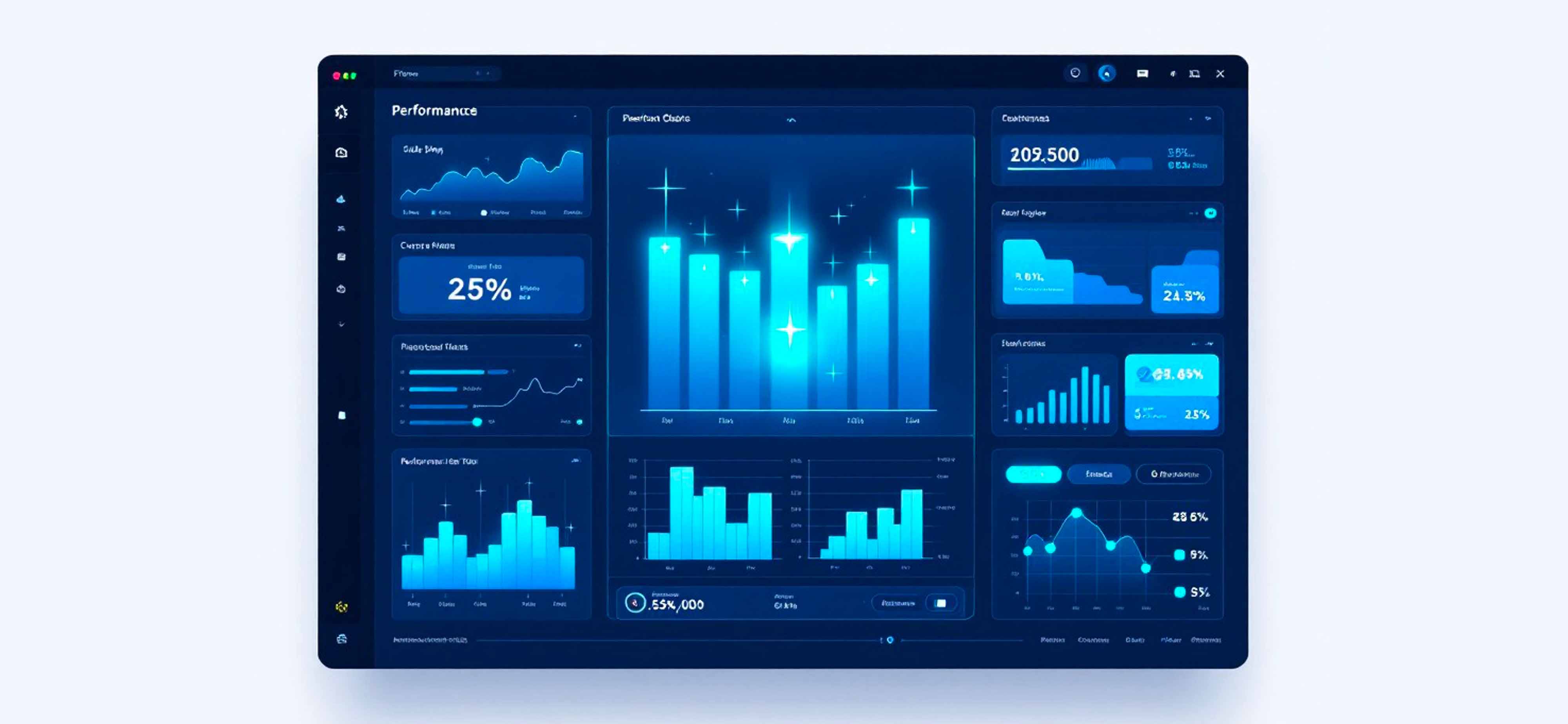
High Fidelity – Execution Phase
Purpose: final validation and build readiness.
Appearance: brand visuals, real components, responsive layouts.
Focus: precision, accessibility, UI quality.
When teams jump ahead too quickly, they sacrifice learning for the illusion of progress.
How to Prevent Wireframe Misuse in Enterprise Programs
1. Explicitly Set Expectations With Stakeholders
Begin every session with:
“These wireframes represent logic, not final UI.”
It’s simple, but it protects the entire process.
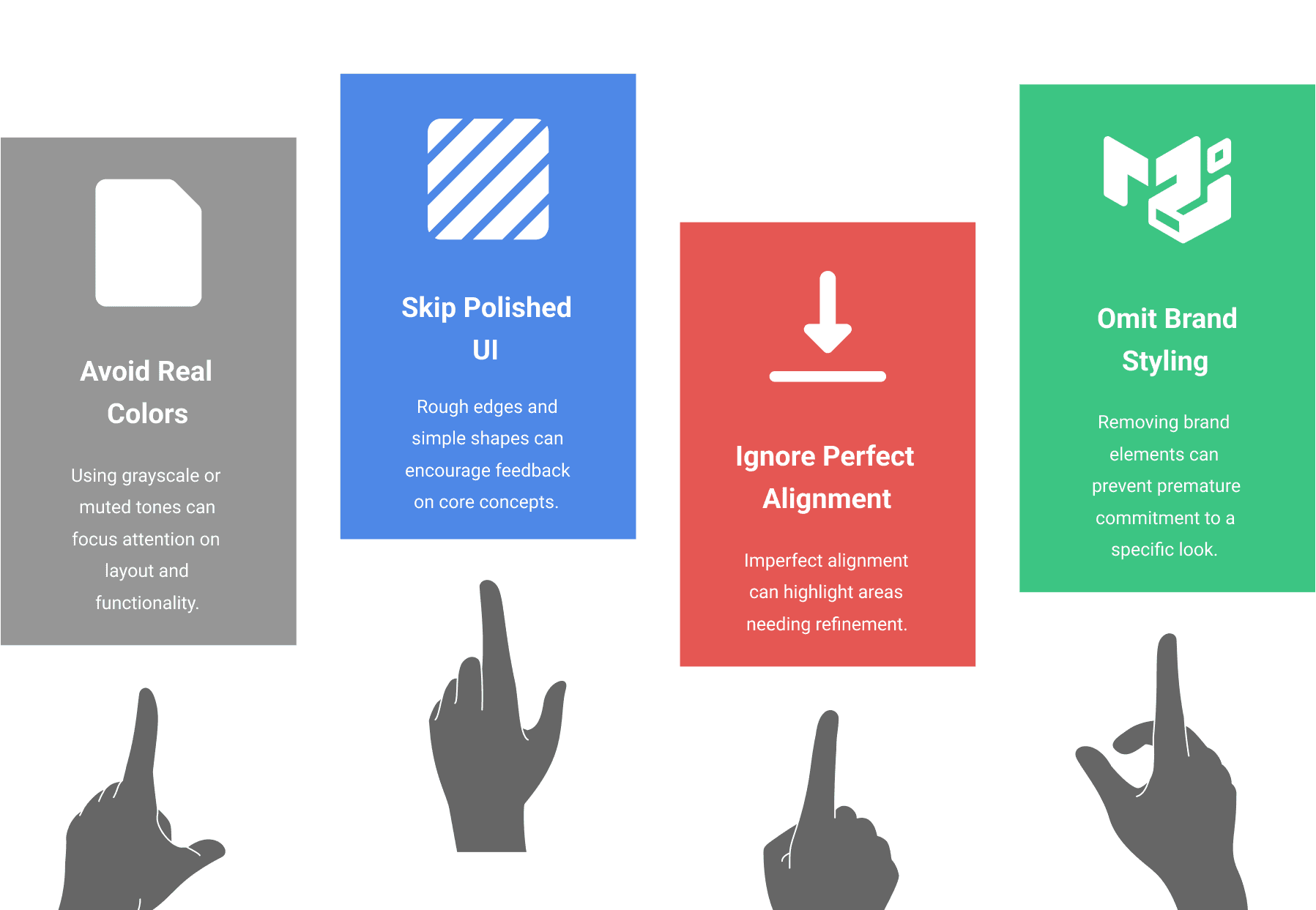
2. Intentionally Design Low-Fidelity Artifacts
This means deliberately avoiding:
real colors
polished UI components
perfect alignment
brand styling
Roughness gives permission to question.
3. Require Validation Before Advancement
A wireframe should not graduate to higher fidelity until:
business rules are confirmed
flows are tested
engineering constraints are understood
user research shows viability
This avoids polishing bad decisions.
4. Show the Journey, Not Just the Destination
Stakeholders who see the evolution from sketch → structure → prototype gain appreciation for the rigor behind UX. It also strengthens trust and support.
5. Empower UX to Guard the Process
UX isn’t the team that makes things look good. UX is the team that ensures things work well. Protecting wireframe integrity is part of that responsibility.
Final Reflection
Wireframes are the backbone of UX strategy when used correctly and a severe liability when misused.
Beautiful wires can convince teams they’re further along than they truly are. They can mislead executives, distort research, and trap engineering into premature decisions.
In complex industries, where compliance, integration complexity, and user needs intersect, the cost of premature fidelity is enormous.
Pretty doesn’t mean ready.
Ready means validated, aligned, and strategically sound.
Strong UX teams embrace this discipline, and strong organizations support it.
By Chemsseddine SALEM | UX Research & Product Design | 2025