The Cultural Impact on Design Psychology: How Culture Drives UX and UI Decisions
Design doesn’t live in a vacuum; it lives in people’s heads and those heads are shaped by culture.

Design doesn’t live in a vacuum; it lives in people’s heads and those heads are shaped by culture. Culture influences how we perceive risk, read signals, process information, evaluate trust, and make choices. That means culture is not just a “nice to consider” aspect of UX and UI; it’s a foundational factor in design psychology that determines whether your product feels intuitive, credible, and valuable or foreign, confusing, and untrustworthy.
This article unpacks how culture drives UX and UI decisions using a design-psychology lens. You’ll find a clear structure, concrete examples in every section, and practical techniques you can use right away. No table of contents just a direct, end-to-end narrative that you can drop into your site as a long-form, SEO-friendly article.
1) Why Culture Matters in Design Psychology
Design psychology studies how people perceive, think, feel, and behave in response to interfaces. Culture shapes all four. It affects the mental models people bring to an interface, the visual signals they trust, how they resolve ambiguity, and how they evaluate success or failure.
Examples
Risk perception: A “Try Beta” badge may be exciting in markets that reward novelty; in risk-averse cultures it can signal instability.
Help-seeking: In highly individualistic cultures, users may explore independently before reading help content; in collectivist contexts, they may prefer guided, step-by-step flows with examples and community cues.
Google Workspace Beta Banner (US) vs. LINE Pay Beta (Japan) showing how visual language affects perceived risk.
Google Workspace Beta Banner (US): https://workspace.google.com/

LINE Pay Beta (Japan): https://line.me/en/pay

2) Core Cultural Lenses Designers Can Use
Culture is complex, but several foundational frameworks help designers anticipate how people in different societies interpret and interact with interfaces. These cultural lenses are not stereotypes they’re tools for framing hypotheses that you can test through research and analytics.
2.1 Individualism vs. Collectivism
This dimension captures whether people see themselves primarily as independent individuals or as part of a group.
Individualistic cultures (e.g., United States, Netherlands, Australia) value autonomy, personal choice, and self-expression.
Collectivist cultures (e.g., Japan, China, South Korea, much of the Middle East) emphasize harmony, social responsibility, and group belonging.
Design implications
Navigation and choice: Individualistic users prefer open exploration and customization, while collectivist users favor guided flows that promote consensus or group benefit.
Copy tone: “You” vs. “We” framing changes message resonance.
Social proof: Peer validation and community numbers carry more weight in collectivist settings.
Examples
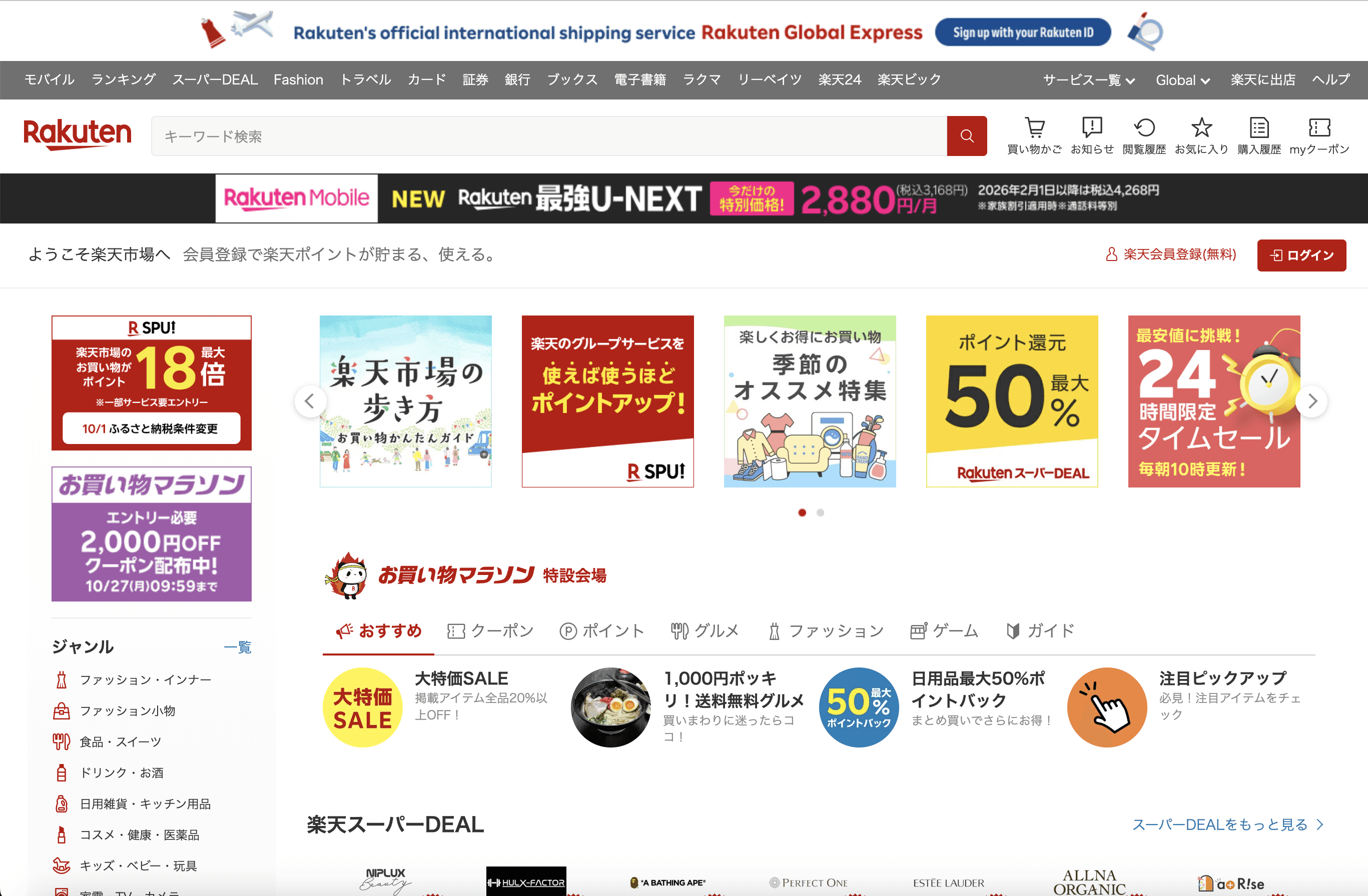
E-commerce:
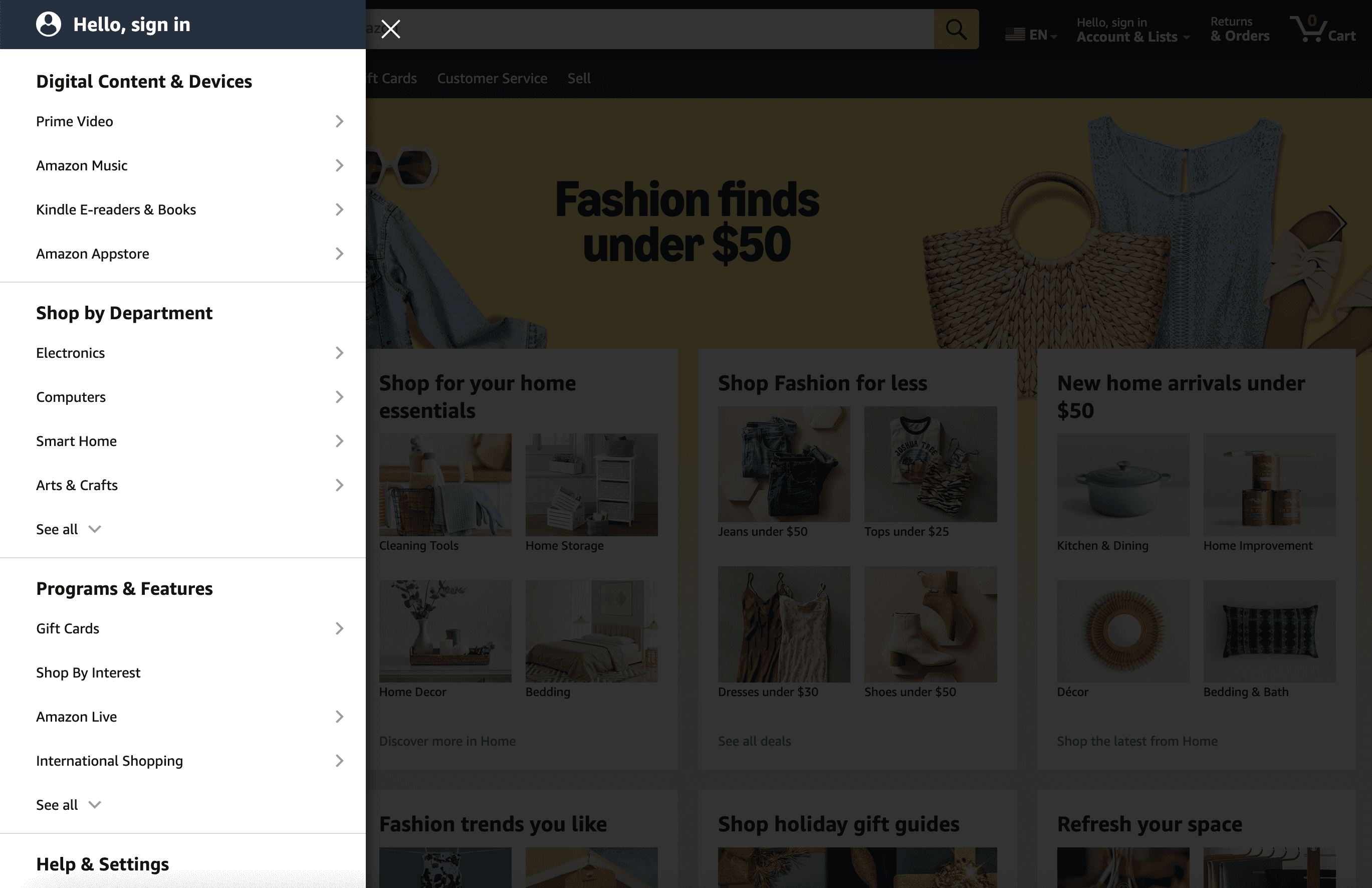
Amazon’s US homepage emphasizes personalized recommendations (“Your account,” “Inspired by your browsing”), highlighting individual autonomy.
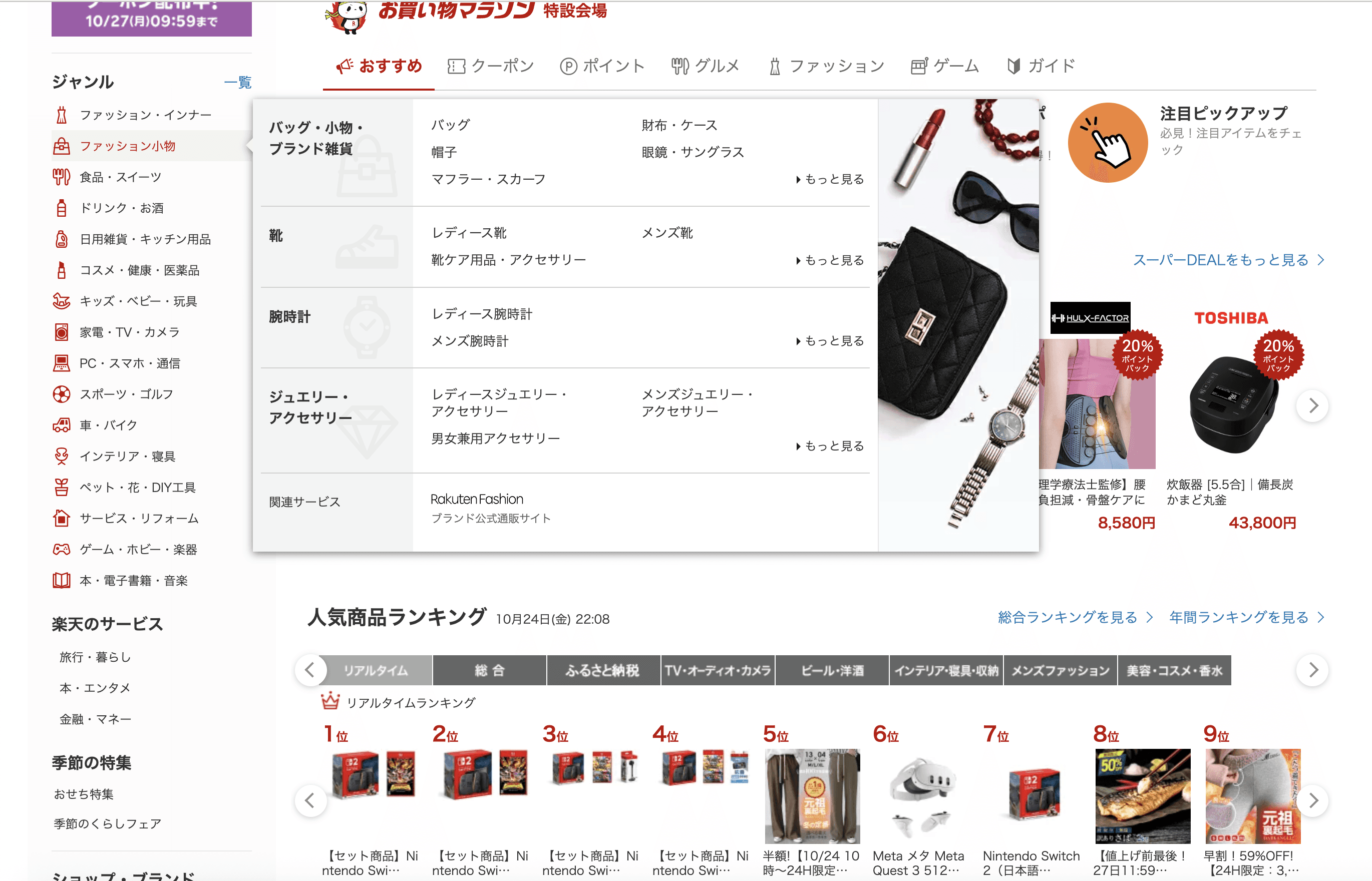
Rakuten Japan, by contrast, highlights community rewards, shared deals, and store ratings, signaling collective participation.Productivity apps:
A Western version of a collaboration tool like Notion might headline “Build your workspace your way.”
A collectivist-market variant could lead with “Work together in one shared space.”Onboarding:
A fintech app entering Southeast Asia added “Join 12 million members saving together” instead of “Start your personal savings goal,” increasing trust and completion rates.
Amazon US homepage personalized “Your account,” “Inspired by your browsing” (individual autonomy).
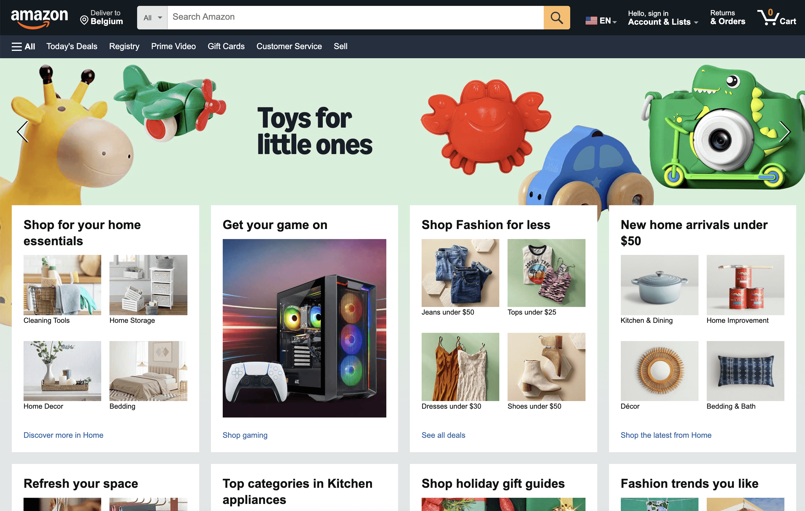
Rakuten Japan homepage community rewards, group points.
2.2 Power Distance (Hierarchy Acceptance)
Power distance measures how comfortable people are with unequal power relationships between managers and employees, teachers and students, or brands and consumers.
Low power distance (e.g., Scandinavia, New Zealand, Canada): users expect equality, transparency, and conversational tone.
High power distance (e.g., China, India, UAE, Russia): users expect authority cues, credentials, and structured guidance.
Design implications
Tone and hierarchy:
Formal structure and credentials can increase perceived reliability in high power-distance cultures.
Informal language and peer comparison can feel more trustworthy in egalitarian cultures.Information architecture:
Authoritative signposts (“Verified,” “Certified,” “Official”) are comforting where hierarchy is respected.Visual hierarchy:
Larger logos, seals, or endorsements often perform better in high power-distance contexts.
Examples
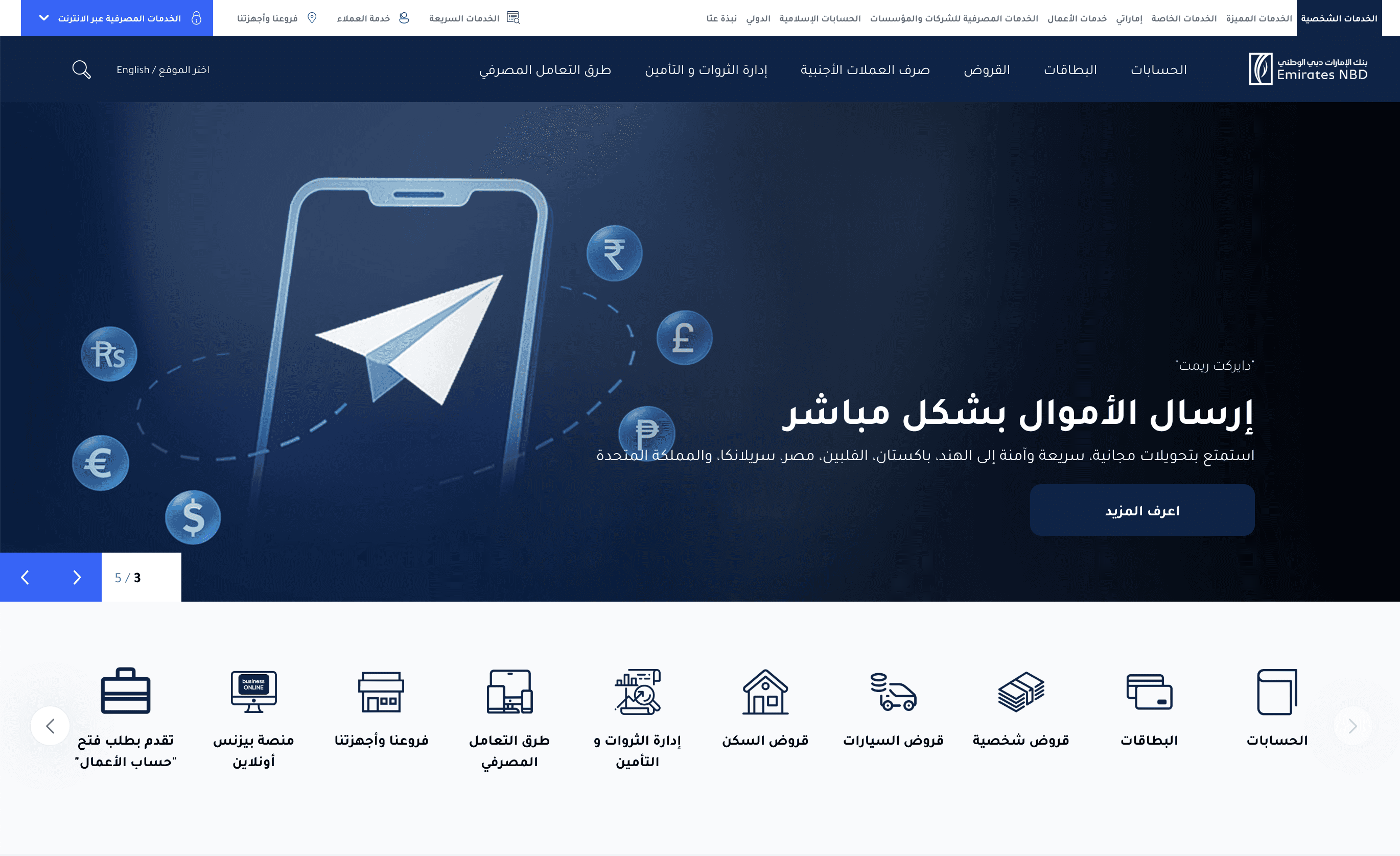
Banking platforms:
In the UAE, a digital banking app increased conversion by leading its sign-up page with Central Bank approval badges and a CEO message.
In Sweden, removing the CEO message and replacing it with a transparent FAQ about data privacy improved sign-ups.Healthcare:
A hospital booking system in India added doctor qualifications and institution logos prominently at the top; this improved trust scores by 25%.
In the Netherlands, the same layout tested as intimidating users preferred short bios and peer reviews below photos.Education platforms:
Coursera localizes its certificates differently: in hierarchical regions, certificates emphasize university seals; in low power-distance markets, course descriptions stress learner autonomy and skill gain.
UAE banking app - signup screen with CEO endorsement and certification badges.
Swedish equivalent - with transparent FAQ replacing CEO message.
2.3 Uncertainty Avoidance
Uncertainty avoidance describes how comfortable a culture is with ambiguity, risk, and new experiences.
High uncertainty avoidance (e.g., Japan, Greece, France) cultures favor predictability, structure, and rules.
Low uncertainty avoidance (e.g., UK, Singapore, US) cultures embrace experimentation and flexible workflows.
Design implications
Flow design: Linear, step-by-step guidance reassures users in high-avoidance cultures.
Error handling: Provide clear, prescriptive error recovery.
Feature rollout: Beta tags, open experiments, or “early access” work better in low-avoidance markets.
Examples
Financial onboarding:
A European investment app tailored for Germany implemented a 5-step progress bar with constant reassurance (“Next: verify ID,” “Next: set risk level”). Completion rose 18%.
The same product’s US version condensed onboarding into two screens, with a “Skip for now” option a design that resonated with more exploratory users.Travel booking:
Japanese users preferred explicit “final confirmation” screens with detailed cost breakdowns.
British users preferred a one-tap checkout and an undo option; too many confirmation dialogs reduced conversion.Beta features:
When a Southeast Asian SaaS tool replaced “Experimental feature” with “New trusted feature under evaluation,” adoption doubled, indicating lower tolerance for risk language.
2.4 High-Context vs. Low-Context Communication
Proposed by anthropologist Edward T. Hall, this lens distinguishes how much meaning is carried by context versus explicit content.
High-context cultures (e.g., Japan, China, Arab nations, Latin America): rely on shared understanding, non-verbal cues, and indirect messages.
Low-context cultures (e.g., Germany, US, Northern Europe): prefer direct, explicit, and linear communication.
Design implications
Copy length and precision: Low-context users want explicit, self-contained instructions.
Visual language: High-context users can infer from imagery and layout; verbose explanations can feel redundant.
Error feedback: Direct vs. polite phrasing can alter user trust.
Examples
User assistance:
A Chinese e-commerce app tested better with minimalist tooltips that used icons and subtle cues.
A German version required explicit field labels and error messages (“Enter postal code in 5-digit format”) for success.Marketing banners:
In the US, a banner reading “Save 15% this weekend only” works directly.
In Japan, a softer phrasing “Enjoy special savings this weekend” and a visual motif of celebration aligned better with implicit communication norms.Customer support chat:
An American chatbot performed well with short, concise messages (“Sure! Let’s fix that”).
The same bot adapted for Thailand added polite particles and emojis, improving customer satisfaction and perceived warmth.
US e-commerce: Direct “Save 15% this weekend only.”

Japan e-commerce: “Enjoy special savings this weekend” with visual motifs.
2.5 Long-Term vs. Short-Term Orientation
This dimension reflects how societies prioritize perseverance and future rewards versus immediate results and gratification.
Long-term oriented cultures (e.g., China, South Korea, Japan, Germany): value patience, foresight, and sustained relationships.
Short-term oriented cultures (e.g., US, Canada, much of Latin America): value quick outcomes, status, and immediate rewards.
Design implications
Gamification and motivation: Long-term cultures respond better to progress tracking and mastery; short-term cultures to immediate wins.
Retention design: Subscription models vs. one-off promotions.
Loyalty programs: Cumulative points vs. instant coupons.
Examples
Fitness app:
In South Korea, a fitness app emphasized streaks, badges for consistency, and progress history. Retention rose 20%.
In the US, offering instant discount rewards for completing milestones outperformed long streak mechanisms.E-learning:
Japanese learners preferred visible mastery levels and percentage progress bars (“80% toward Level 3”).
Latin American learners engaged more when given immediate certificates and shareable badges after each micro-lesson.Banking:
A savings product in Germany highlighted compound interest growth over years; a North American variant emphasized quick auto-round-ups and short-term savings goals.
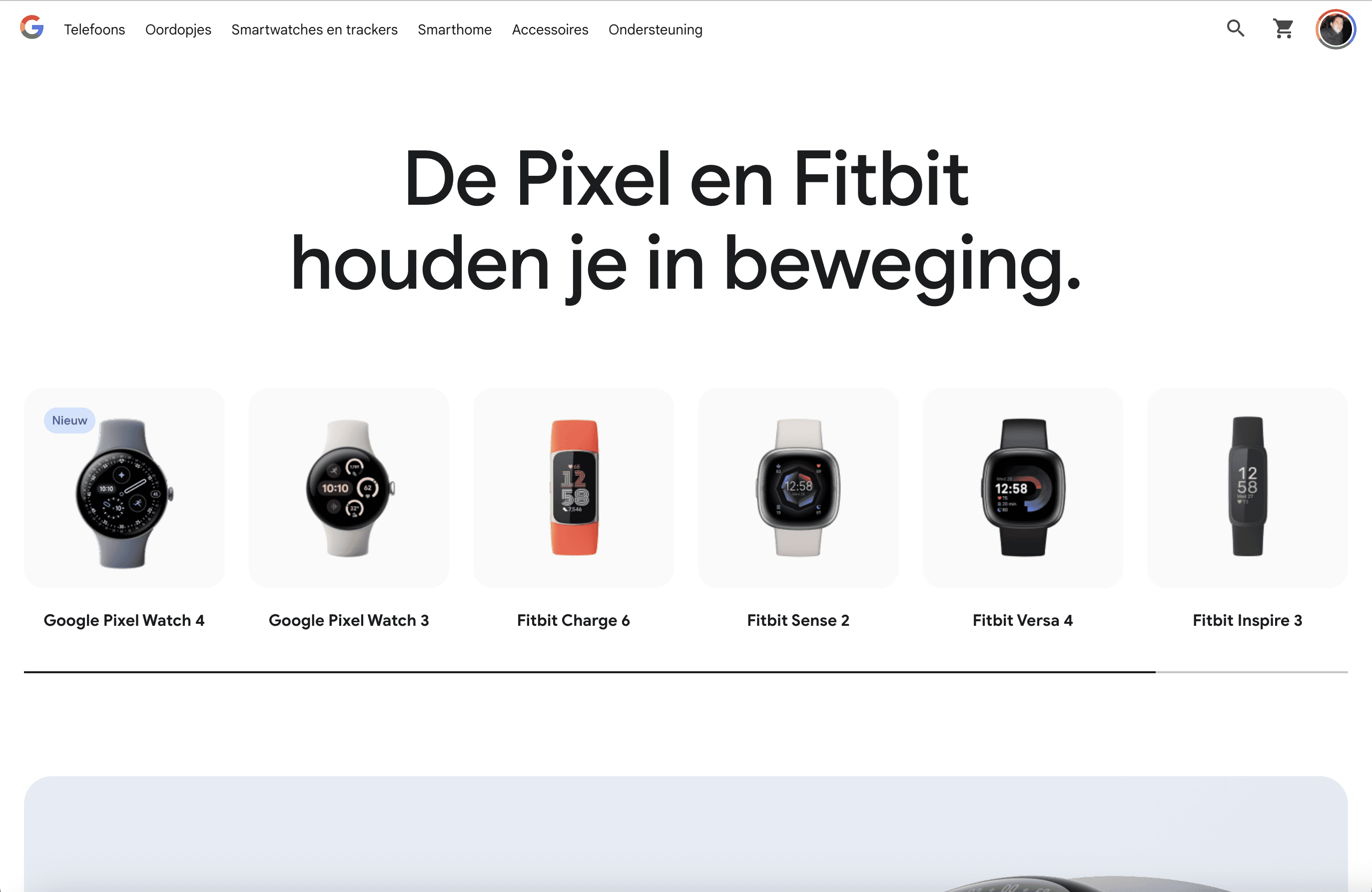
Samsung Health (Korea) focusing on streaks & progress tracking.
Fitbit (US) focusing on instant milestone rewards.
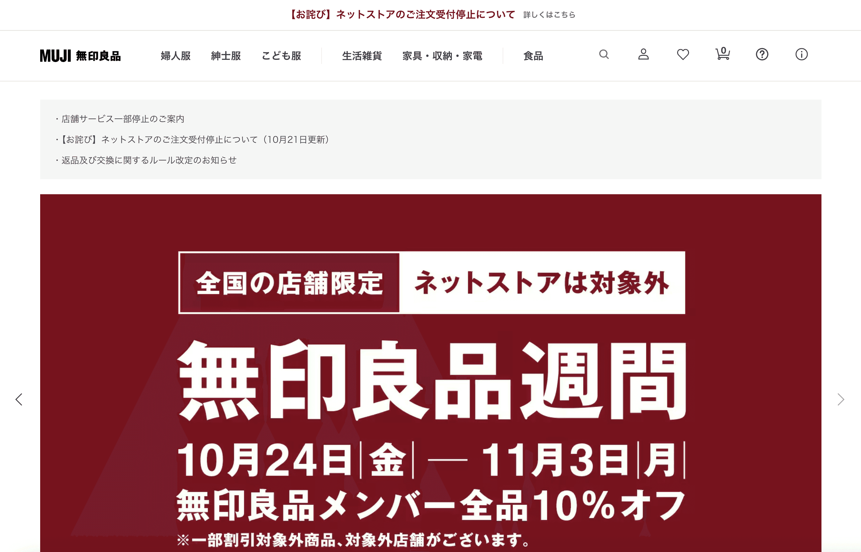
2.6 Indulgence vs. Restraint
Indulgence measures how freely societies allow gratification and leisure, while restraint values self-control and social norms.
Indulgent cultures (e.g., US, Mexico, Australia): emphasize enjoyment, humor, and optimism.
Restrained cultures (e.g., China, Russia, parts of Eastern Europe): emphasize duty, modesty, and control.
Design implications
Visual style: Bright colors, casual language, and playful motion suit indulgent contexts; restrained cultures prefer subdued palettes and formal cues.
Tone of voice: Humor vs. seriousness.
Call-to-action framing: “Have fun” vs. “Achieve responsibly.”
Examples
Travel platforms:
Airbnb’s US home screen uses warm imagery and copy like “Find your next adventure.”
Its China portal leans on safety, trust, and verification (“Travel confidently, stay securely”).Food delivery apps:
In Brazil, playful motion graphics and emojis boosted engagement.
In Russia, the same visuals felt unprofessional; toned-down branding increased credibility.Financial wellness:
In Australia, a budgeting app added a celebratory confetti animation after goals users loved it.
In South Korea, the same animation tested as frivolous; replacing it with a progress completion banner improved satisfaction.
Airbnb US homepage - lifestyle imagery, vibrant palette.
https://www.airbnb.com/
Airbnb China - subdued colors, trust verification cues.
https://www.airbnb.cn/
3) Cultural Differences in Perception & Cognition
3.1 Reading Direction and Layout
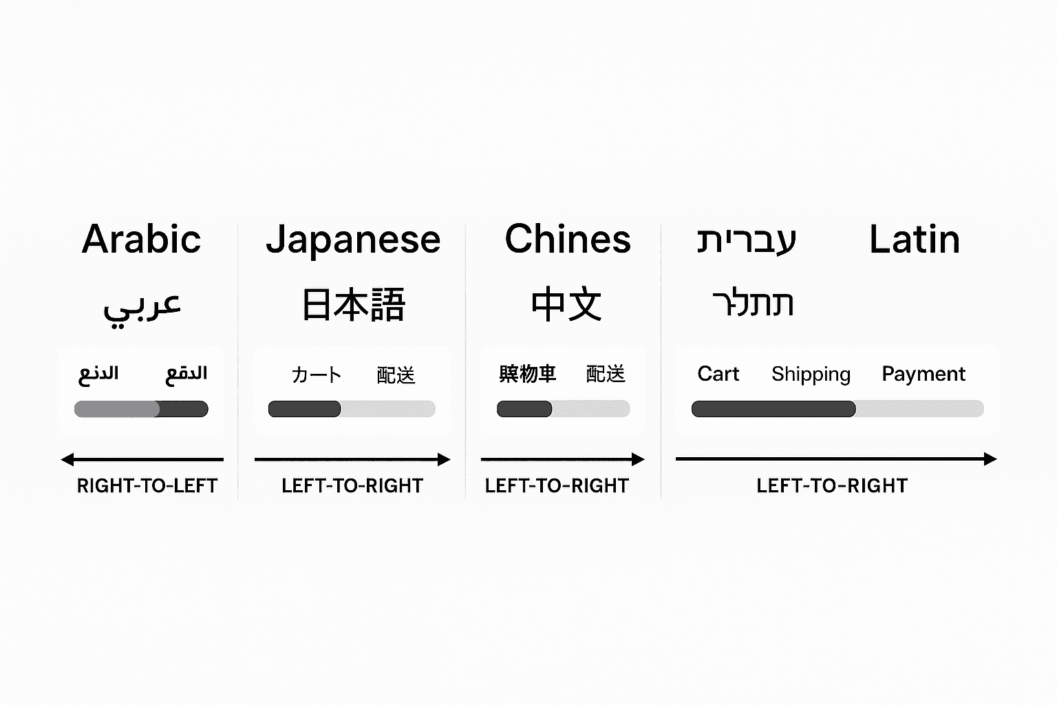
Right-to-left scripts (Arabic, Hebrew) change scanning patterns, which affects hierarchy, icon orientation, progress indicators, and navigation placement.
Example: A checkout progress bar that moves rightward may feel wrong in RTL contexts; mirroring the flow (and flipping directional icons) raises perceived fluency.
3.2 Color Semantics
Color meanings aren’t universal. Red can mean warning or celebration; white can mean purity or mourning, depending on locale.
Example: A “limited-time deal” banner that uses red for urgency in North America may inadvertently suggest festive celebration in parts of Asia. Testing a neutral or locally validated accent boosts conversion.
3.3 Numeracy, Date, and Address Formats
Locale-specific formats (decimal separators, week starts, postal address order) are not just details they affect errors, trust, and data quality.
Example: A B2B invoice tool that auto-formats IBANs differently by country reduces failed payments and support load.
4) Information Architecture & Navigation
4.1 Depth vs. Breadth
Some cultures tolerate deeper hierarchies if they feel well-organized; others prefer flat navigation with faster access to top actions.
Example:
US e-commerce: A broad mega-menu with prominent search and quick filters.
Japanese marketplaces: Category depth with nested lists and dense link clusters works because it aligns with local browsing habits.
US e-commerce
Japanese marketplaces
4.2 Sequenced vs. Parallel Paths
High uncertainty-avoidance audiences prefer linear, stepwise flows; exploratory audiences enjoy branching.
Example: A mortgage pre-approval journey can present a wizard with locked steps in Germany, while offering skippable sections and playful calculators up front in Australia or the US.
5) Visual Language: Iconography, Imagery, Motion
5.1 Iconography and Metaphor
Icons draw on shared cultural knowledge. A mailbox, piggy bank, or hand gesture won’t always translate.
Example: Replacing a “thumbs-up” confirmation with a neutral checkmark avoided negative connotations in markets where the gesture can be offensive.
5.2 Imagery and Representation
People respond to images that reflect local contexts attire, architecture, workplaces, family structures.
Example: A fintech onboarding hero image showing bank branches and cash tested better in cash-heavy economies; the same screen performed worse where contactless dominates. Swapping imagery increased sign-up completion by double digits.
5.3 Motion and Tempo
Animation timing conveys brand personality. Fast, snappy motion can signal efficiency; longer easing can feel premium or sluggish depending on expectations.
Example: A travel app’s map pins “snap” animation was shortened by 100–150 ms for US users to feel responsive, while a slightly longer ease-out tested as more “refined” in parts of Western Europe.
6) Content & Tone: Language, Formality, and Framing
6.1 Formal vs. Informal Address
Forms of address (T/V distinction), honorifics, and politeness strategies vary widely.
Example:
Germany/Japan: Formal address and explicit instructions reduced error rates on tax-related forms.
US/UK: Friendly, concise microcopy increased completion rates in consumer sign-ups.
6.2 Directness vs. Indirection
Low-context cultures value explicit instructions and disclosures; high-context cultures tolerate implication and brevity.
Example: A privacy consent dialog that spells out data uses in bullets improved trust in the Netherlands, while a concise summary with a link to detail tested better in Korea.
6.3 Framing Value Propositions
Individual outcomes vs. community benefits vs. duty/obligation lenses all change message resonance.
Example: An energy app:
US: “Lower your bill by optimizing usage.”
Nordics: “Use energy smarter good for you and the grid.”
Parts of East Asia: “Join millions optimizing usage together.”
7) Trust, Credibility, and Persuasion Patterns
7.1 Authority vs. Peer Signals
In some contexts, institutional endorsements, certifications, and seals matter more than peer reviews; elsewhere, social proof dominates.
Example: A healthcare portal in high power-distance markets led with hospital and ministry badges; in low power-distance contexts it led with patient ratings and transparent doctor profiles.
7.2 Scarcity, Urgency, and Defaults
Persuasive patterns can feel manipulative in some cultures and perfectly normal in others.
Example: “Only 2 rooms left” tested as compelling in the US but increased perceived pushiness in parts of Germany and Switzerland; switching to “Demand is high on these dates here are flexible alternatives” increased bookings and reduced cart abandonment.
8) Interaction Patterns & Microinteractions
8.1 Gestures and Controls
Swipe conventions, long-press expectations, pull-to-refresh, and back gestures are not universally learned.
Example: A news app added visible pagination dots and a ‘Next’ button to support users less familiar with horizontal swipes; time-on-page increased without hurting power users.
8.2 Error Handling and Feedback Style
Some audiences prefer gentle, indirect error messages; others want precise, technical feedback.
Example:
Indirect: “We couldn’t verify that code. Let’s try again.”
Explicit: “Code expired. Request a new one.”
A/B tests often show regional divergence on which tone reduces repeat errors.
9) Localization (L10n) and Internationalization (i18n) as System Capabilities
9.1 Mirroring and Reflow
True RTL support means more than flipping text; arrows, progressions, charts, carousels, and iconography must mirror.
Example: A budgeting app mirrored line-chart tooltips (time flows right-to-left) and reversed “previous/next” in pagers usability scores rose in Arabic.
9.2 Variable Length and Hyphenation
German and Finnish strings expand; Chinese contracts. Components and grids must absorb both gracefully.
Example: A primary button system with text-hug + min/max width tokens preserved hierarchy across languages without truncation.
9.3 Locale Engines and Validation
Currencies, decimal separators, calendars, name orders, and address formats need locale-aware parsing.
Example: Shipping forms that accept kana address lines and postcode-first layouts for Japan cut failed deliveries and reduced support tickets.
10) Researching Across Cultures: Methods and Pitfalls
10.1 Recruit Locally, Moderate Locally
Participants are more candid and context-specific with moderators who share language and cultural norms.
Example: Switching to local moderators for concept tests in India yielded twice as many actionable insights versus remote English-only sessions.
10.2 Triangulate Methods
Combine diary studies, contextual inquiry, metrics, and lab tasks; any single method can reflect cultural bias.
Example: A mobility app paired ride-along ethnography with event analytics to see how social norms (e.g., sitting in the front seat) shaped UI expectations around driver communication.
10.3 Incentives and Etiquette
Incentives, scheduling, and communication etiquette differ by region.
Example: Evening testing slots and modest gift cards worked well in the US; weekend mid-day and bank transfer honoraria boosted show-up rates in Southern Europe.
11) Governance, Design Systems, and Cultural Flexibility
11.1 Design Systems as Cultural Infrastructure
A global system needs design tokens for typography, spacing, and color but also policy tokens (e.g., consent patterns), copy patterns, and illustration guidelines per region.
Example: One fintech maintained three color palettes (default, festive-positive, high-contrast) mapped to locales; marketing toggled palettes seasonally without engineering work.
11.2 Federated Ownership
Central coherence + local autonomy. A small core team curates primitives; regional teams own variant libraries.
Example: A marketplace’s “Core Search Card” had stable structure and a region-specific “value rail” (coupons in Brazil, eco-score in Germany, seller badges in Japan).
11.3 Guardrails Over Gatekeeping
Codify non-negotiables (accessibility, security, privacy) and leave room for local adaptation.
Example: A “Consent Modal Blueprint” enforced intent clarity and keyboard navigation while allowing local copy, button order, and legal links.
12) Measurement: Proving Cultural Design Works
12.1 Funnel and Task Metrics per Locale
Track completion, time to success, and error clusters by language/region.
Example: A tax app spotted address-line errors spiking only in French Canada; updating field hints with French examples reduced errors by 28%.
12.2 Perception and Trust
Pair NPS/CSAT with perceived clarity and perceived fairness scales; culture influences both.
Example: Adding a transparent fee breakdown raised “fairness” ratings and referrals in the UK and Nordics.
12.3 Reuse and Velocity
Measure percentage of screens built from global components vs. local variants and the lead time to ship.
Example: Regional teams that kept ≥70% global components shipped new flows 30–40% faster while still hitting local conversion goals.
13) Practical Playbooks You Can Apply Now
13.1 Onboarding Playbook
Global shell: Progress indicator, skip/resume, autosave.
Local levers: ID types, address conventions, consent wording, proof-of-residency examples.
Example: A bank in LATAM added utility-bill examples on upload; completion jumped without extra support calls.
13.2 Pricing & Plans Playbook
Global shell: Monthly/annual toggle, feature table.
Local levers: Currency, tax display norms, “most popular” vs. “best value” tag.
Example: “Best value” edged out “Most popular” in Singapore; the reverse held in Canada.
13.3 Support & Help Playbook
Global shell: Search, top articles, contact pathways.
Local levers: Live chat hours, phone vs. messaging, escalation etiquette.
Example: Adding WhatsApp support in the UAE outran email adoption 5:1 within a month.
14) Common Pitfalls and How to Avoid Them
14.1 Stereotyping by Passport
National averages hide subcultures, urban/rural gaps, and generational differences.
Example: Youth-focused flows in Spain performed more like US cohorts than older domestic segments; segment by behavior, not just geography.
14.2 One-Off Localization
Culture evolves; treat localization as a lifecycle.
Example: Quarterly copy audits caught outdated tax language after reforms in Poland, preventing a surge of support tickets.
14.3 Fragmented Variant Sprawl
Too many local forks kill maintainability.
Example: A “variant registry” with owners, KPIs, and retirement dates kept the system lean and accountable.
15) Mini Case Snapshots (Cross-Domain)
Messaging Apps: WhatsApp vs. WeChat vs. LINE
WeChat’s super-app model thrives where integrated ecosystems and mini-programs fit habits; WhatsApp remains lean in markets preferring single-purpose tools; LINE’s stickers and rich media align with local social norms.Retail Marketplaces: Amazon vs. Rakuten vs. Temu
Amazon’s search-first, efficiency-driven flows fit low-context, choice-heavy expectations; Rakuten leans into rich categorization and loyalty ecosystems; Temu’s gamified deals resonate where social buying and value hunting are cultural pastimes.Banking UIs:
Northern Europe favors sober typography, low-friction payments, explicit disclosures; parts of Southern Europe test better with warm microcopy and human imagery; GCC markets respond strongly to institutional credentials and service concierges.
16) Implementation Checklist (Condensed)
Research: Local participants, local moderators, triangulated methods.
System: Tokens for locale; RTL mirroring; flexible components.
Content: Formality rules, examples localized, consent clarity.
Visuals: Validated color semantics; inclusive imagery; tempo tuning.
IA: Depth vs. breadth matched to local browsing habits.
Trust: Right mix of authority badges and peer signals.
Metrics: Funnels by locale; fairness and clarity scores; reuse velocity.
Governance: Federated ownership; guardrails; variant registry.
Example application: When entering three new markets, ship a global core, then run 3×3 experiments (color accent, value framing, trust placement) per locale. Keep winners, sunset losers, and update the design-system registry.
Culture is not a layer you “apply” to a finished interface it’s the context that gives your interface meaning. When you treat culture as a first-class design input, your product feels instantly more understandable and trustworthy. When you don’t, even beautifully crafted UIs can feel strangely “off.”
Think of cultural design as a continuous loop: learn → adapt → measure → standardize → repeat. Build a system that lets you respect local expectations without sacrificing global coherence. Do that, and your UX will stop feeling like a translation and start feeling like it was made for people because it was.
Author by Chemss Salem
CopyRight by Chemss Salem