The Foundations of UX Trust: Designing Confidence in Regulated Industries
Designing trust in UX means crafting clarity, transparency, and accountability, especially in finance, energy, and healthcare industries.

Trust is the invisible currency of every user experience but in regulated industries like banking, finance, energy, healthcare, and insurance, it’s the only currency that truly matters. Users don’t just interact with interfaces; they entrust their data, money, and sometimes their safety to systems they can’t fully see or understand.
When a user logs into a mobile bank, reviews a digital energy bill, or shares medical information online, the experience must feel as reliable as it is secure. And that feeling isn’t an accident it’s a result of deliberate, evidence-based UX design choices that convey credibility, clarity, and control.
This article explores the foundations of UX trust the psychological, visual, and operational design principles that foster confidence in high-stakes, regulated environments. It will help UX leaders, researchers, and product teams understand how to build trustworthy digital experiences from the ground up.
1. Why Trust Is the Core UX Metric in Regulated Industries
Most industries measure UX success through usability, satisfaction, or task completion. But in regulated contexts such as finance, energy, healthcare, and public services those metrics are secondary to one overarching goal: user trust.
A user may forgive a slightly longer task flow, but not a moment of doubt about data privacy, financial safety, or transaction accuracy.
In a 2024 PwC Digital Trust report, over 85% of users in regulated markets said that “trust in digital services” directly influenced their willingness to adopt or recommend a brand. In contrast, only 42% said speed or visual appeal affected their trust level.
Key insight: In these industries, UX doesn’t just guide behavior it shapes belief.
Designing for trust means designing for reliability perception a combination of transparency, predictability, and reassurance throughout the journey.
2. The Three Pillars of UX Trust
Trustworthy UX is not built through aesthetics alone. It rests on three interdependent pillars that align with both human psychology and regulatory compliance.
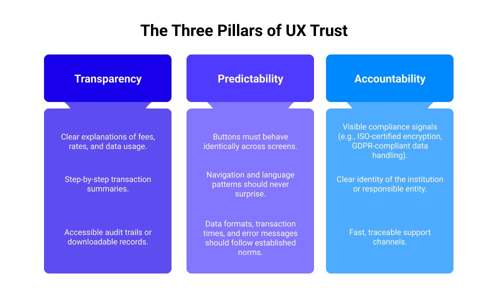
2.1 Transparency
Transparency means users can see and understand what’s happening, why it’s happening, and what will happen next.
In finance or energy apps, this translates to:
Clear explanations of fees, rates, and data usage.
Step-by-step transaction summaries.
Accessible audit trails or downloadable records.
When interfaces hide complexity, users feel vulnerable. When they reveal it clearly, users feel empowered.
Best practice: Replace generic confirmations like “Your request was submitted” with specific, contextual messages e.g., “Your wire transfer of €1,200 to HSBC UK has been securely processed. Expected arrival: 24 hours.”
2.2 Predictability
Predictability reinforces a sense of safety. Every action should lead to an expected and consistent outcome.
Buttons must behave identically across screens.
Navigation and language patterns should never surprise.
Data formats, transaction times, and error messages should follow established norms.
Predictability becomes particularly critical during edge cases like errors, timeouts, or reauthentication. A transparent, empathetic error message (“Your session expired for security reasons. Please log in again to continue.”) does more to preserve trust than a vague or technical one.
2.3 Accountability
Accountability means the organization not just the interface stands behind its product. It’s demonstrated through:
Visible compliance signals (e.g., ISO-certified encryption, GDPR-compliant data handling).
Clear identity of the institution or responsible entity.
Fast, traceable support channels.
The goal is to make users feel that if something goes wrong, someone is accountable not just an algorithm.
3. Regulatory Context: The Hidden Architecture of UX Trust
Every regulated sector imposes legal frameworks that indirectly shape UX. Designers working in these environments must understand how regulation influences perception.
Industry | Core Regulations | UX Impact |
|---|---|---|
Banking & Finance | PSD2, GDPR, AML/KYC | Strong authentication flows, consent mechanisms, transparency about data sharing |
Energy | ISO standards, sustainability disclosures | Clear communication of pricing and usage data |
Healthcare | HIPAA (US), GDPR (EU) | Strict control over patient data access and confidentiality cues |
Insurance | Solvency II, Consumer Duty | Ethical disclosure, understandable policy explanations |
Public Services | Accessibility (WCAG 2.2), Data protection | Inclusive design and traceable consent logs |
While regulation aims to protect users, it can also create friction. The UX challenge is to translate compliance requirements into confidence-building moments instead of barriers.
Example:
A mandatory KYC verification step can frustrate users if presented abruptly.
But reframing it as “For your security, we verify your identity using encrypted, regulated systems. This ensures your funds are always protected.” turns compliance into reassurance.
4. The Psychology of Digital Trust
Designing trust starts with understanding the human mind under uncertainty.
Cognitive psychology identifies three mechanisms that govern whether users trust a system:
4.1 Competence
Users assess if the system “knows what it’s doing.” They infer this from precision, speed, and clarity.
Loading indicators with progress percentages convey control.
Consistent formatting (currency, time, units) signals reliability.
Well-written microcopy demonstrates intelligence and care.
4.2 Integrity
Users evaluate whether the system aligns with their moral expectations.
Honest tone and transparent options build moral credibility.
Avoid manipulative patterns (dark UX, preselected consents).
Provide opt-out choices early, this signals integrity more than any policy page.
4.3 Benevolence
Benevolence is the emotional dimension, users must feel the system cares about them.
Empathetic feedback (e.g., “We know this is sensitive. Your data is encrypted and visible only to you.”)
Supportive error states (“We couldn’t verify your document. Here’s how to fix it quickly.”)
Personalized reassurance (“Welcome back, Leila, last time you checked your consumption report, you saved 8%.”)
Trust flourishes when competence, integrity, and benevolence coexist. Remove one, and the experience begins to feel transactional, not trustworthy.
5. Visual Design Cues That Communicate Trust
Visual perception accounts for 80% of trust signals in digital environments. Subtle changes in layout, typography, or color can radically alter how users judge credibility, often unconsciously.
5.1 Color and Contrast
Blues, greens, and neutrals tend to evoke security and calm common in banking interfaces.
High contrast supports accessibility and legibility, conveying technical robustness.
Avoid overuse of red unless signaling warnings it can trigger anxiety.
5.2 Typography
Professional typefaces (sans-serif or semi-serif) communicate seriousness and stability.
Avoid novelty fonts users associate them with informality or risk.
Use consistent typographic hierarchy; inconsistency feels careless.
5.3 Layout and Density
Whitespace equals mental space. Dense, cluttered screens suggest hidden complexity.
Logical grouping of information creates cognitive safety.
Minimal animations reduce cognitive noise crucial in serious contexts like healthcare or fintech.
5.4 Iconography and Symbolism
Icons can clarify or confuse. Avoid ambiguous metaphors (e.g., “shield” vs. “lock”).
Always combine icons with labels.
Use familiar symbols for secure, download, confirm, or warning actions.
Tip: In A/B tests conducted by fintech companies, interfaces that used a “lock” icon next to payment forms increased trust perception scores by up to 23% compared to identical forms without the icon.
6. Content Design: Language as a Trust Signal
Words shape perception. In regulated sectors, language must achieve clarity without dilution simple but never simplistic.
6.1 Write Like a Regulator and a Human
Balance precision (legal clarity) with empathy (human understanding).
Poor Copy | Trustworthy Copy |
|---|---|
“Your application is under processing.” | “We’re reviewing your application. You’ll get an update within 24 hours.” |
“An error occurred.” | “Something went wrong on our side please try again, or contact support.” |
“Please refer to terms and conditions.” | “You can review how your data is used in our 2-minute summary.” |
6.2 Hierarchical Disclosure
Provide information progressively:
Show what’s essential first.
Allow deeper exploration for those who need it (accordions, tooltips, learn more links).
This satisfies both legal teams and cognitive load limits.
6.3 Tone Consistency
Inconsistent tone (formal on one page, casual on another) breaks continuity and trust.
A good rule: speak as a knowledgeable, calm advisor, not a salesperson.
7. Microinteractions and Emotional Anchors
Microinteractions loading states, confirmations, transitions are the emotional heartbeat of UX trust.
Examples that strengthen confidence:
Progressive feedback: “We’re verifying your identity (Step 2 of 3).”
Positive confirmation: “Securely received. Your data is encrypted and stored in compliance with EU GDPR.”
Micro-delights: small animations that signal completion without distraction.
These details create rhythm and predictability. In financial apps, the subtle “tick” sound or checkmark animation at payment completion reassures users emotionally even before they read the confirmation text.
8. Research and Testing: Measuring UX Trust
Trust can (and should) be measured.
8.1 Quantitative Metrics
Trust Index (TI): derived from user surveys using Likert-scale statements such as “I feel safe performing financial actions here.”
Drop-off rate during verification: a proxy for perceived friction.
NPS correlation with “confidence” keywords in user feedback.
8.2 Qualitative Insights
Contextual inquiry: observing how users behave in high-risk scenarios.
Trust mapping workshops: identifying trust enablers vs. blockers in each interaction phase.
Emotion curves: tracking moments of tension, confusion, or relief throughout a task.
8.3 Continuous Validation
In regulated contexts, compliance changes constantly. UX teams must collaborate with legal, risk, and IT security units to validate both trust perception and trust compliance.
9. Case Studies: UX Trust in Action
9.1 Revolut - Designing Trust Through Visual Transparency
Industry: Digital Banking & Finance
Region: Global (UK-based, EU-regulated under PSD2 and FCA)

Challenge
As a fast-growing fintech, Revolut faced an early trust challenge: users were hesitant to deposit significant funds into a digital-only bank without physical branches or traditional reputation. The question was, how can a fully digital interface replace the psychological assurance of a physical institution?
UX Trust Strategy
Revolut approached this through visual and informational transparency:
Real-time feedback: Transactions update instantly, reducing uncertainty.
Predictable navigation: Core banking actions (send, exchange, withdraw) remain consistent across web and mobile.
Visual hierarchy: Clear typography and ample whitespace reinforce readability and confidence.
Progressive trust cues: Users see step-by-step verifications for each transfer (amount, confirmation, success state).
Their interface design intentionally mirrors traditional banking reassurance, but with digital immediacy.
Outcome
Revolut’s UX-led transparency helped it overcome “digital bank hesitation.” According to 2024 Brand Trust Index (YouGov), Revolut ranked among the top 3 most trusted UK fintechs, despite lacking long-established institutional legacy.
UX Lesson: Trust can be visually designed through transparency and predictable interaction loops, even without physical presence.
9.2 Monzo - Emotional Honesty and Tone of Voice
Industry: Digital Banking
Region: UK (FCA-regulated)
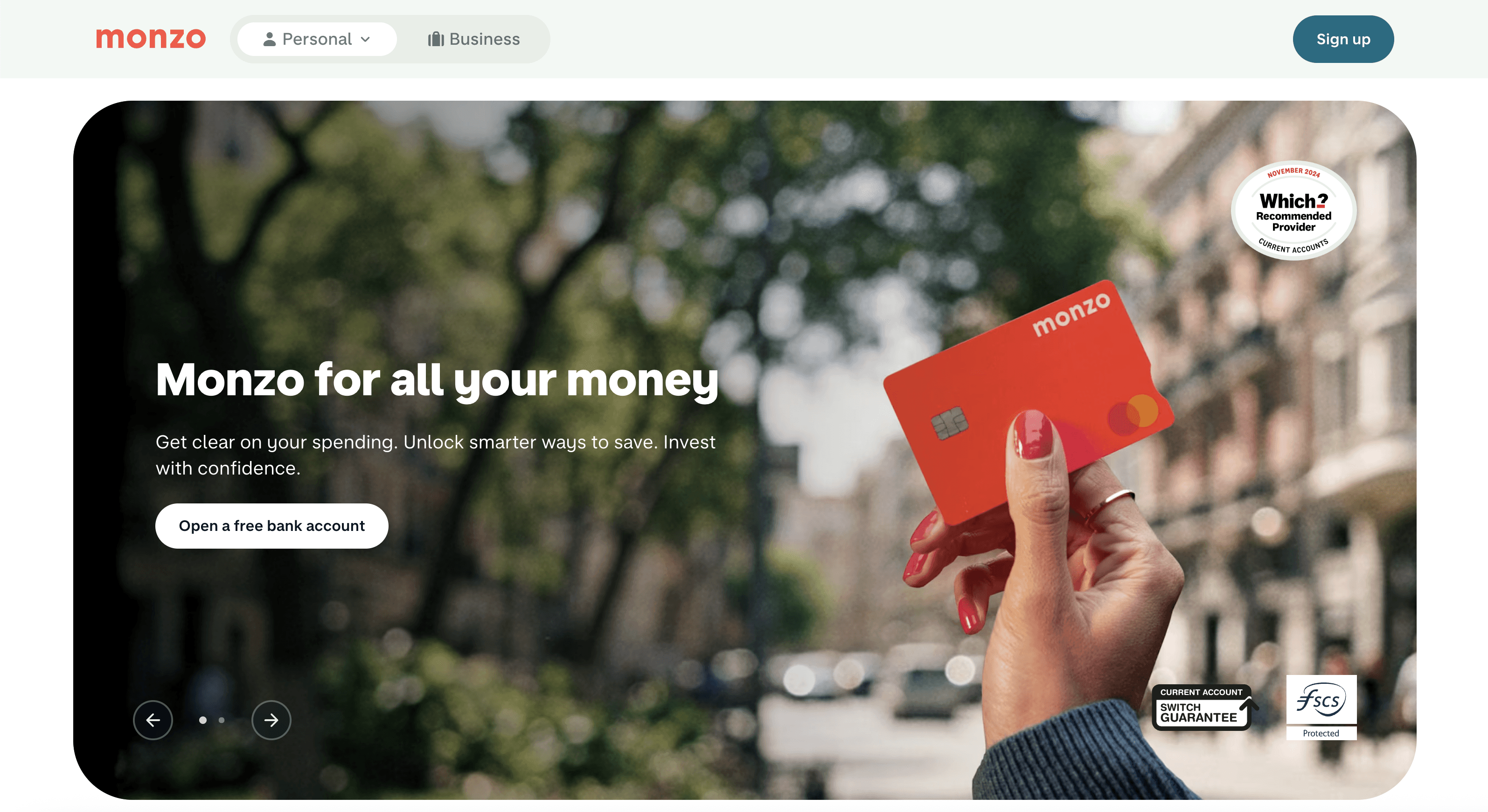
Challenge
In financial communication, users often distrust opaque or overly formal language. Monzo realized that tone not just design plays a decisive role in user trust.
UX Trust Strategy
Monzo built an internal Content Design & Tone Framework centered on honesty, clarity, and warmth.
Examples:
Replacing technical error messages (“Transaction declined due to insufficient funds”) with empathetic explanations (“Looks like there wasn’t enough in your account to make this payment. You can try again once you’ve topped up.”)
Designing human-first notifications - short, positive, and emotionally neutral.
Maintaining language consistency across all channels, from app to help center to email.
They also integrated instant customer support via chat, making accountability visible.
Outcome
Monzo’s conversational UX tone became a brand signature, earning it an NPS above 70 in 2023 and consistent user perception as “the most human digital bank.”
UX Lesson: Empathy and honesty in microcopy create emotional trust particularly where money is involved.
9.3 EDF Energy - Trust Through Data Clarity
Industry: Energy & Utilities
Region: France / UK / EU-regulated
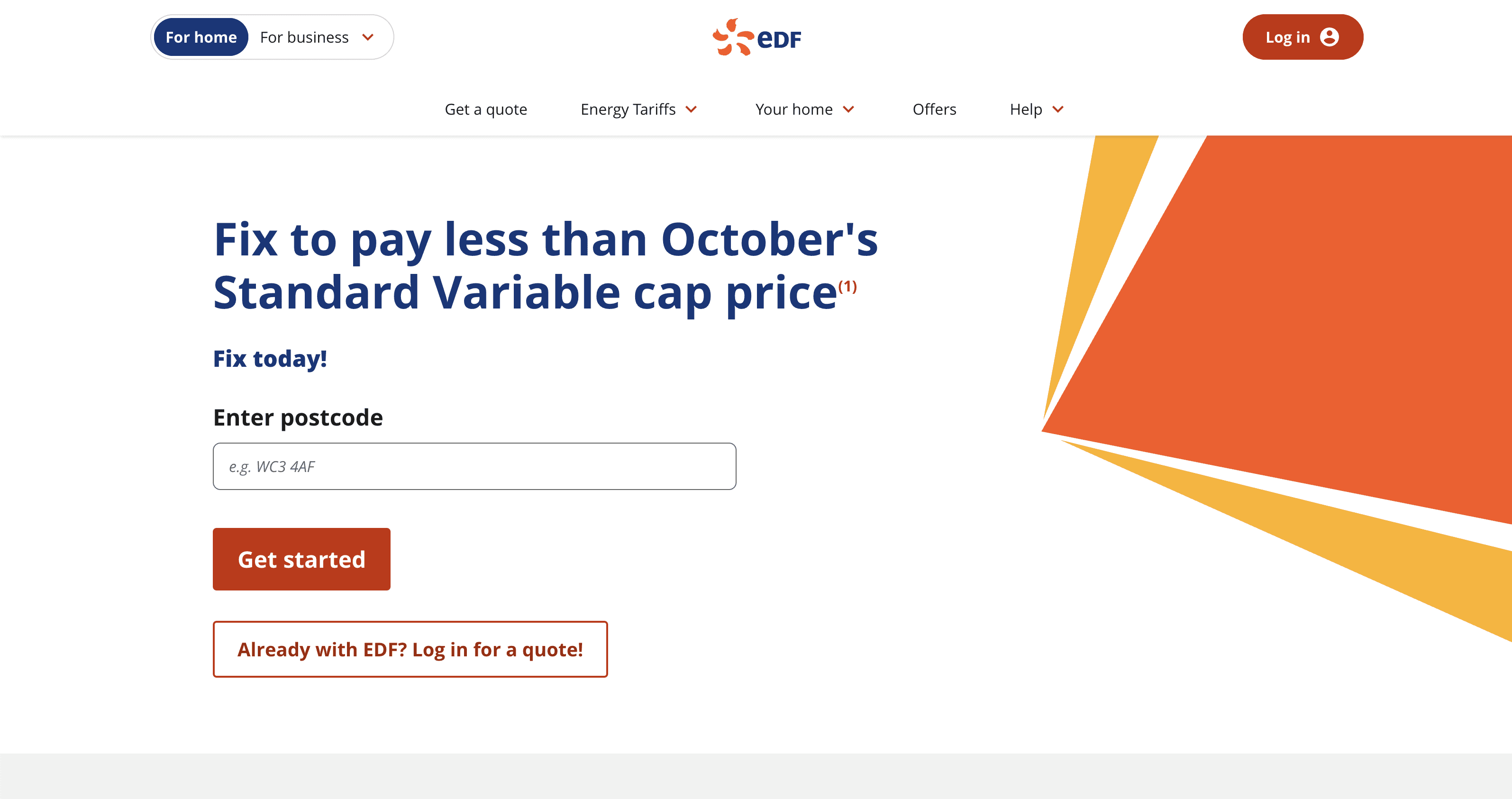
Challenge
Energy companies face skepticism about billing transparency, data accuracy, and environmental accountability. EDF needed to turn complex energy data into a trustworthy digital story.
UX Trust Strategy
EDF redesigned its digital dashboard around cognitive transparency:
Introduced data storytelling visuals (graphs showing consumption over time with contextual comparisons “Your usage is 12% lower than last month”).
Used plain language for billing and carbon impact (“You saved enough to power 3 homes for a day”).
Added clear source attribution, every metric links to its data source (“Meter reading updated automatically via Smart Meter ID #XXXX”).
Implemented predictable update intervals always same day/time each week.
Outcome
EDF’s “MyEnergy” dashboard achieved a 37% increase in digital engagement and reduced customer billing complaints by 21% within a year (internal EDF Digital Transformation Report, 2024).
UX Lesson: Data transparency transforms skepticism into confidence when visualized in human-centered, predictable ways.
9.4 NHS Digital - Trust in Sensitive Information Systems
Industry: Healthcare
Region: United Kingdom (NHS / GDPR / HIPAA principles)
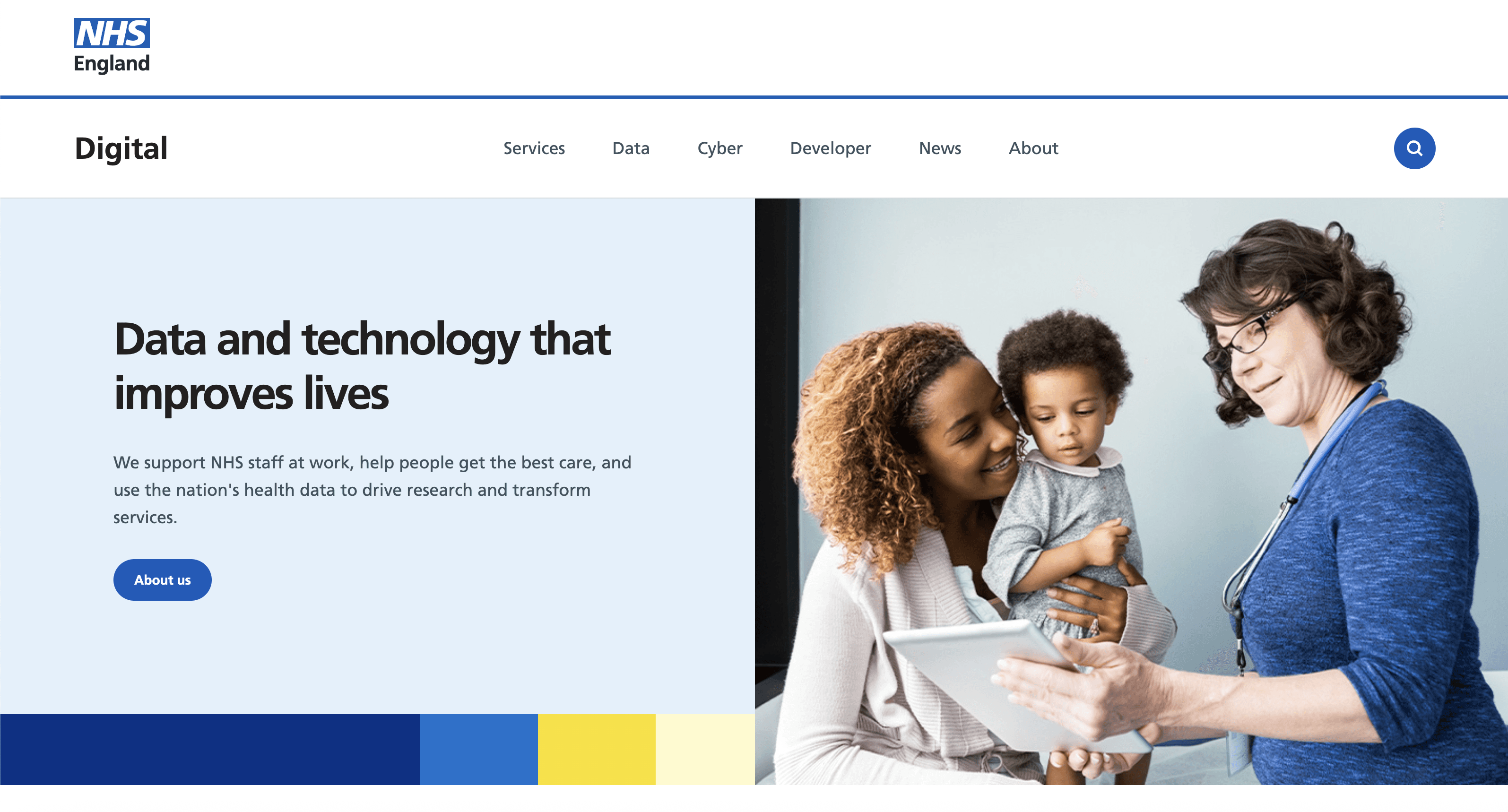
Challenge
NHS Digital manages sensitive patient records. Trust breaches could cause national backlash. Their design goal was to make data security emotionally reassuring without creating fear.
UX Trust Strategy
Explicit reassurance copy: Every sensitive interaction displays a contextual reassurance line “Only your care team can see this data.”
Accessible authentication: Multi-factor sign-ins are framed as safety measures (“We’re verifying you to protect your records”).
Empathetic tone: Avoids bureaucratic or alarmist language.
Consistency of design: The NHS blue palette, typography, and layout are used across all digital portals to maintain institutional familiarity.
They also performed trust-mapping workshops with patients to identify which points in the journey caused anxiety (e.g., uploading medical results, sharing consent). These were redesigned with stepwise reassurance.
Outcome
User satisfaction scores (2023) showed a +42% increase in “feeling secure when using NHS digital services.” The UX design is now referenced in UK Government Service Design manuals.
UX Lesson: Consistency + reassurance = trust. In high-risk sectors, predictability reduces emotional stress.
9.5 ING Bank - Trust by Design Compliance
Industry: Banking / Financial Services
Region: Netherlands / EU-wide under PSD2 and GDPR
Challenge
With the introduction of PSD2 (Payment Services Directive 2), banks had to allow third-party access to user data with explicit consent. Users feared privacy loss.
UX Trust Strategy
ING designed visual consent frameworks to empower users:
Used progressive disclosure: “You are allowing App X to view your transaction history. You can revoke anytime.”
Added timed permissions (e.g., 90 days access) with reminders.
Implemented consistent iconography for third-party trust (verified “shield” badge for regulated partners).
Provided educational overlays explaining what PSD2 means turning compliance into clarity.
Outcome
The redesign increased user consent completion by +33% while maintaining full regulatory compliance. ING’s consent flow became a best-practice model adopted by several European financial institutions.
UX Lesson: Compliance doesn’t have to create friction: it can become an education and reassurance opportunity.
9.6 AXA Insurance - Visualizing Reliability in Abstract Products
Industry: Insurance & Risk Management
Region: Global (EU and US markets)

Challenge
Insurance products are intangible users can’t “see” what they’re buying. This makes trust inherently fragile. AXA needed to visualize reliability.
UX Trust Strategy
Developed interactive policy simulators showing “what’s covered” in realistic scenarios.
Used story-based UX - short animations demonstrating how claims are handled step by step.
Designed empathic onboarding: friendly tone, fewer legal terms upfront, and immediate access to claim status dashboards.
Introduced trust icons (certified partner badges, 24/7 support indicators).
Outcome
Post-redesign analytics (2023) showed a 25% increase in online policy conversions and a 17% drop in abandonment during claim filing.
UX Lesson: When services are abstract, trust must be visualized through tangible journeys, transparency, and reassurance at every step.
9.7 Swissgrid - Trust Through Operational Transparency
Industry: Energy Infrastructure (National Grid)
Region: Switzerland / EU-regulated
Challenge
Swissgrid manages national power infrastructure, reliability perception is critical. Users (business and government clients) needed confidence in system stability and data accuracy.
UX Trust Strategy
Public-facing dashboards show real-time grid frequency and load live data as trust signal.
Open data API - anyone can verify Swissgrid metrics independently.
Minimalist visual identity focused on precision, not marketing flair.
Accessible reports explaining outages in plain language with timestamps and corrective actions.
Outcome
Swissgrid’s public transparency portal became a benchmark for governmental UX communication. It increased stakeholder trust and reduced misinformation during energy crises.
UX Lesson: Operational transparency builds macro-level trust showing, not telling, reliability.
Synthesis: Cross-Case Insights
Across these examples, a pattern emerges the mechanics of trust are consistent, even when industries differ:
Trust Dimension | Revolut / Monzo | EDF / Swissgrid | NHS / AXA / ING |
|---|---|---|---|
Transparency | Real-time data, visible transactions | Open metrics, clear consumption data | Visual consent and open policy details |
Predictability | Consistent navigation and feedback | Routine updates | Standardized tone and visual systems |
Accountability | Clear identity and instant support | Source attribution | Human reassurance, compliant frameworks |
Empathy | Honest tone and conversational design | Contextual storytelling | Emotionally calm, supportive UX |
In short:
Trustworthy UX = Cognitive clarity + Emotional reassurance + Institutional accountability.
10. Future Directions: Designing Trust for Emerging Technologies
As regulated industries embrace AI, blockchain, and data automation, the definition of trust is evolving.
10.1 Explainable AI
Users will no longer accept “black box” results.
Explainable AI interfaces (XAI) showing why a system made a decision will become mandatory in financial risk scoring, insurance pricing, and healthcare diagnostics.
10.2 Zero-Trust Security Models
Instead of assuming internal safety, zero-trust models require verification at every stage.
UX designers must ensure this added friction is framed as protection, not punishment e.g., adaptive authentication that feels invisible unless risk is detected.
10.3 Ethical Design Frameworks
Designers are now expected to uphold digital ethics fairness, transparency, accessibility not just usability.
In EU contexts, the AI Act and Digital Services Act will soon require that products “demonstrate trustworthiness by design.”
Trust will move from being a UX goal to a regulatory mandate.
11. Practical Framework: Building Trust by Design
Here’s a repeatable framework UX teams can apply across regulated domains:
Phase | Objective | Key Actions |
|---|---|---|
Discovery | Understand user anxieties | Interviews, emotion mapping, trust archetypes |
Definition | Translate regulation into experience principles | Compliance collaboration, design-legal co-creation |
Design | Embed trust visually and verbally | Visual consistency, microcopy, predictable flows |
Validation | Test for perception, not just performance | Trust score surveys, usability under stress scenarios |
Iteration | Maintain trust as regulation evolves | Continuous user listening, accessibility audits, transparency updates |
12. Conclusion: Trust as a Design Strategy
Trust is no longer a byproduct of good UX it is UX.
In regulated industries, users don’t just evaluate usability or beauty; they evaluate risk. They ask unconsciously:
“Do I feel safe here? Do they deserve my confidence?”
Every design element from typography to tone, from authentication flow to help message answers that question.
To build experiences that last, organizations must treat trust as a strategic design system, not a soft emotional outcome. The foundations are clear:
Transparency that informs.
Predictability that reassures.
Accountability that protects.
When those align, regulated industries can turn their greatest constraint, regulation into their greatest competitive advantage: confidence by design.
Author by Chemss Salem
CopyRight by Chemss Salem


